Early (Pre-2018) Plotting Notes
Last updated: Oct14,2018
- Early python XY plotting tools.
- Early software tools and sample data files.
- A very simple example.
- Just gimme a goldurn example.
- The basic plotting tools.
- A table file and an operation with it.
- A simple interactive XY extraction tool.
- A high-level plotting script.
- Fitting curves to XY data.
- Plotting a figure to size.
Early software tools and sample data files.
Here I discuss tools I developed to fit and plot XY data. We often want
to plot (X,Y) data from a simple file containing columns and rows. We might
want to compute basic statiistics for given column, or fit some curve to the
(X,Y) data pairs. Often we just want to plot up Y vs. X and see what is there.
We need a way to do this in a simple interactive way, but we may also want the
ability to make plots in a batch approach. All of these things are covered here.
I have tried to include descriptions of some of the low- and high-level routines.
Every routine discussed here should have a clear usage message as well as a more
extensive help page iy the "--help" flag is invoked. I include an appendix at
the end of this doc that gives some fairly terse practical examples. Finally, it
should always be true that you cab replicate the steps descibed here using the
sample files packed into this tarblall file.
Once you have grabbed theis link you caqn get the sample files by:
% cp ~sco/Downloads/samples.tar .    # My downloads typically go here
% tar xvf samples.tar
./samples/
./samples/UT20160617-hetq-tz.file_1
./samples/UT20160617-hetq-tz.file_2
./samples/hetAZindo_dec01.dat
./samples/XY0.rst_plot
./samples/UT20160617-hetq-tz.file
% ls samples
hetAZindo_dec01.dat      UT20160617-hetq-tz.file_1  XY0.rst_plot
UT20160617-hetq-tz.file  UT20160617-hetq-tz.file_2
You can use these files to learn how my codes operate and also to
confirm that they are still working. The plots made with the two
examples are shown below.
Here is a list of the software tools discussed here. They should all
have usage messages and useful online help messages.
pxy_SM_plot.py    == high-level python plot tool
colget.py         == extract a column from a table file
calstats.py       == compute statistics for an extracted column
xy_from_table     == interactive tool to get X,Y from a table file
xyplotter         == script to run pxy_SM_plot.py
make_fit_data     == generate sample test data
gen_curve.sh      == general curve fitting script
data_strip        == strp the "# data" delimited header from a table file
getNline          == pull the Nth line from a file
number_lines      == write a new version of an ASCII file with the lines numbered
list_cdfp_params  == Use the header of a cdfp file to make a list of table parameters (i.e. column names)
cdfp2table        == read a cdfp file and create a corresponding table file
Whether a code is a bash script, fortan (otw) or python code, you should
always get a fairly complete HELP message using show_help. Here is an example:
% show_help calstats.py
What are cdfp and table files?
A tabla file (see many examples below) is a file of rows and colums, with a header
that explains what is in each column. In many cases, the table file is accopmanied
by a "parameter names" file which gives a short name for each column in the table
(as opposed to a long comment line). The data column can be composed of numeric or
string data.
A cdfp file (CoorDinate Floating Point) is a specialized file I use
for coordinate related files. The first line is always a single string of
heade information. The columns of data are all numeric, and the first two
columns are always the RA in hours and the DEC in units of degrees (both
in floating point format).
The basic plotting tools.
My most general (X,Y) plotting code is named
pxy_SM_plot.py. A
second is routine is trs_plot.py.
The "trs_" package is designed for the less general problem of
visuallizing coordinate transformations, but it uses some nice
examples of point labeling and maintaining proper aspect ratio, etc...
The links above will give you sample calls to these codes, but here
are two quick examples using the sample files discussed above:
% pxy_SM_plot.py style.hetq-tz 0 360 86 91 SHOW
% cat style.hetq-tz
20160617 ACAM Data
HETQ (HET Parallactic Angle)
tz
UT20160617-hetq-tz.file
UT20160617-hetq-tz.file_1
UT20160617-hetq-tz.file_2

% trs_plot.py Style.file -30 30 -30 30 SHOW
% cat Style.file
X,Y Gaussian Data
X (0.0,5.0)
Y (0.0,12.0)
XY0.rst_plot
I show these mainly to demonstrate how similar the calls are. The
first argument is the name of a file that will specify the style
of the plot (axis labels etc...) and the data files to be plotted.
The next four values are axis limits, and the last argument is used
to indicate whether you just want a hard copy file or you want to
use the matplotlib show() module to view and adjust the plot after
it is initially generated. In the first example above I am plotting
three sets of X,Y points (in the file UT20160617-hetq-tz.file, etc...)
and in the second case I am plotting a single set (in the file XY0.rst_plot).
In addition to plotting points, we might fit a curve to some of the
(X,Y) sets and plot the fitted curve. The rest of this document is about
how, given a table file, we can easily set up those Style and XY data files
for doing these things.
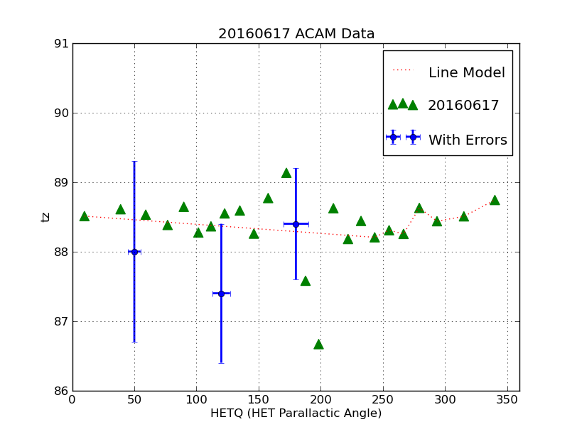 |
This is the plot made with the pxy_SM_plot.py example shown above.
We have plotted data from 3 different files using three basic formats:
data points, a connected line (curve), and points with error bars. A
legend in the upper right labels each set. The command line we used was:
% pxy_SM_plot.py style.hetq-tz 0 360 86 91 SHOW
The first argument is the file that specifies the axis label names and the
names of the data files containing the X,Y values. The next argeuments specify
the X and Y axis limits to be used.
The last argument (SHOW) indicates that we will use the matplotlib show() module
to display the plot interactively. The nice feature here is that we can easily
change the scale and range of each axis and we have the option of producing
a hardcopy plot.
|
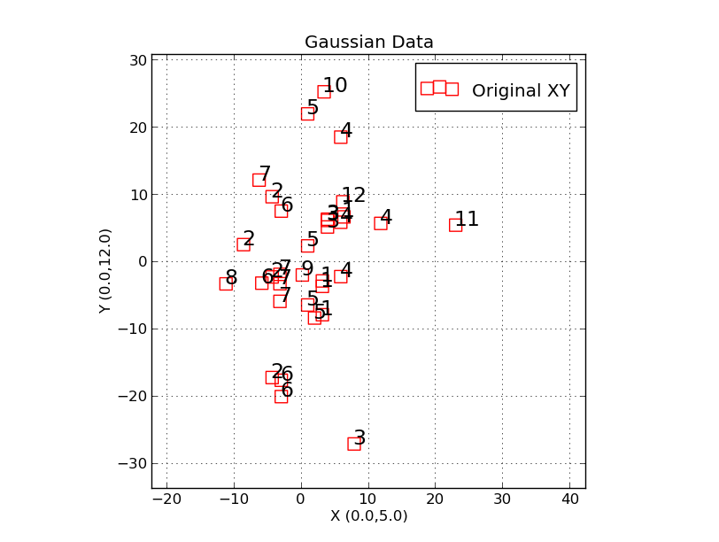 |
This is the plot made with the trs_plot.py example shown above.
We have plotted a set of (random) X,Y points, each of which is labeled
with an identification string. The command line used was:
% trs_plot.py Style.file -30 30 -30 30 SHOW
the X, and Y axis limist to be used. Here I have resized the axes and
re-positioned the data placement in oder to bring into full view some
of points that were initially under the legend.
|
A table file and an operation with it.
I define a table file to be an ASCII file with a header
section. Some would refer to this as a flat file. I always
offset the header of my files with the "# data" string. Here is
an example of the first protion of a table file.
% head -15 hetAZindo_dec01.dat
Col01 = STRUCTAZ, structure azimuth from header
Col02 = AZfromDEC, azimuth based on declination
Col03 = HETQfromAZ, parallactic angle from structure azimuth
Col04 = HETQfromDEC, parallactic angle from structure azimuth based on DEC
Col05 = DECDEG, declination in degree uni ts
Col06 = STRUCTAZ - AZfromDEC
Col07 = HETQfromAZ - HETQfromDEC
Col09 = side of sky relative to meridian
STRUCTAZ, AZfromDEC, HETQfromAZ, HETQfromDEC, DECDEG, AZdif, HETQdif, direction
# data
	180.00 177.75   180.000 178.060   -4.306543 002.25 001.94  E     20161006T001036.7_acm_sci
	180.00 177.75   180.000 178.060   -4.306543 002.25 001.94  E     20161006T001021.3_acm_sci
	180.00 177.75   180.000 178.060   -4.306543 002.25 001.94  E     20161006T001032.8_acm_sci
	180.00 177.75   180.000 178.060   -4.306543 002.25 001.94  E     20161006T001029.0_acm_sci
	180.00 177.75   180.000 178.060   -4.306543 002.25 001.94  E     20161006T001025.2_acm_sci
The entire file is about 3600 lines long,so we jsut show the top
of the file above. You can see the full file in the set of
sample data files discussed in the first section above. The
job before is to use a tool that lets us pull columns and build the
data files we need for our plot tool.
The first thing we have to do is use a tool to pull the columns we want
to plot from the table file. The python tool colget.py is good for this. Suppose I want to plot column 2 of our table (named AZfromDEC) and plot it on the
Y axis as a fuction of column 5 (named DECDEG) on the X axis. With colget.py
I could pull two files, one for each variable, and I can name the files
using the variable name:
% colget.py hetAZindo_dec01.dat 2 AZ1 N
% colget.py hetAZindo_dec01.dat 5 DECDEG N
% ls
AZ1 DECDEG head.lines hetAZindo_dec01.dat S/
% head -5 AZ1
177.75
177.75
177.75
177.75
177.75
In this way I can manually build the file (dat.1) with my X,Y data:
% head dat.1
point g o 90
AZ(from DEC)
-4.306543 177.75
-4.306543 177.75
-4.306543 177.75
-4.306543 177.75
Then I manually make the style file: stayle.1
$ cat style.1
Sample Azimuth Plot
Declination (degrees)
Azimuth (degrees)
dat.1
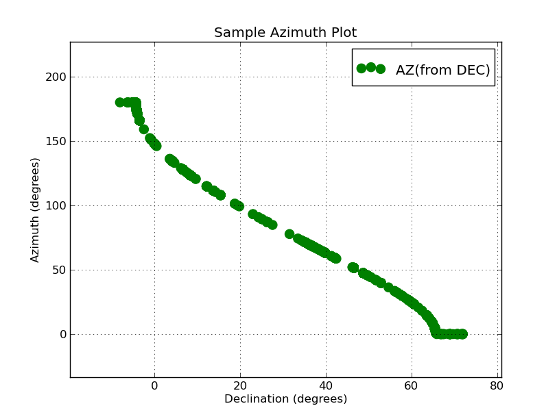
Finally I can make my plot!
% pxy_SM_plot.py style.1 -10 89 0 360 SHOW
The plot we generate this way is shown below.
 |
|
Here is the plot we have generated with the two columns pulled
from out table file. This plot of approximately 3500 poinst was
generated in a couple seconds (not including the time we used
building the files style.1 and dat.1). My inital Azimuth range
was 0 to 360, but becasue I used the show() module I was quickly
able to interactively reset the axes and make a nicer version
of the plot. Why my azimuths run from 0 to 180 instead of 0
to 360 is another question all together! As a result of this
little plot, I could quickly see that I had lost my Azimuth values
between 180 and 360. I went to my routine "estimate_azhet_hetq" and
quickly located the trouble: another misssed dollar sign
in front of a variable name. But, the problem is now fixed!
|
An even shorter example of using a table file is shown in my
appendix section. Take a look at the
Compute column statistics. execise in the
appendix section.
A simple interactive XY extraction tool.
The example in the previous section explains how things are
done, but it is not very practical. What we want is a way to quickly
extract columns from a file and build the plot file we need
for pxy_SM_plot.py.Here is an easy-to-use tool for this:
% xy_from_table hetAZindo_dec01.dat 5 1

* You are queried for the symbol style, marker symbol, color, etc...
* the product is a file named XY.plot that can be fed to pxy_SM_plot.py
With this utility I could pretty quickly assemble plot files from a
large, complicated table file (or files). With this I re-did the
plot in the previous section after I had fixed the azimuth problem.
Also, I was able to grab the AZSTRUCT values from headers and plot
those with a different symbol.
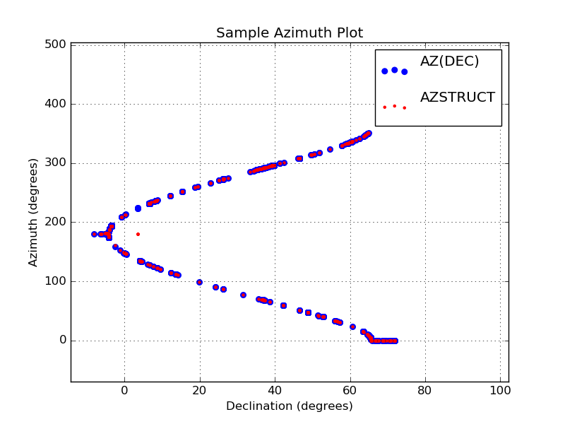 |
Here is the plot from the previous section where I have now fixed
my azimuth problem. I have also added the AZSTUCT values obtained
from ACAM images (these are plotted as small red dots). The plot
files were easily generated with the script xy_from_table. The
commands I used were:
% xy_from_table hetAZindo_dec01.dat 5 1
%  mv XY.plot XY.plot_1
% xy_from_table hetAZindo_dec01.dat 5 2
%  mv XY.plot XY.plot_2

# I manually create the style.1 file
% cat style.1
Sample Azimuth Plot
Declination (degrees)
Azimuth (degrees)
XY.plot_1
XY.plot_2

% pxy_SM_plot.py style.1 -10 89 0 360 SHOW
Again, I note that I changed the plot limits on each axis using the
show() module. The values at high azimuth were running in the point
legend in the upper-right of the plot. With show() it was trivial
to correct this on the fly.
|
Finally, I'll mention that "xy_from_table" has a little trick built in.
You can read the plot info automatically if you build a local file
named "xy_from_table.input" that has the necessary parameters written to it.
This is not terribly useful for a single manual run, but as we'll see in
the next section, it can be very useful for building a higher-level tool.
Here is an example of using this mode:
% cat xy_from_table.input
point r o 50 "My Comment"

[sco@mcs T1]$ xy_from_table hetAZindo_dec01.dat 5 1

[sco@mcs T1]$ head -5 XY.plot
point r o 50
"My Comment"
  -4.306543	  180.00
  -4.306543	  180.00
  -4.306543	  180.00
As you see, there are no interactive queries. You just get your
plot file (XY.plot) right after the call. Now we could build something
that would make repeated calls to xy_from_table, build our style file, and
finally run our pxy_SM_plot.py code for us. Not terribly trivial, but a
heck of lot easier than the manual procedures we've been using thus far.
A high-level plotting script.
I have developed a fairly simple script for doing all of the tasks discussed above.
It pulls columns from a Table file and prepares the XY data files.
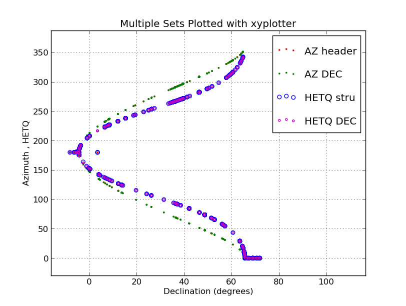 |
I have plotted four rather large data sets from a single ASCII
file (the file hetAZindo_dec01.dat) using the "xyplotter" code.
[sco@mcs T1]$ cat List.axes
Multiple Sets Plotted with xyplotter
-20  130   Declination (degrees)
  0  360   Azimuth , HETQ

[sco@mcs T1]$ cat List.data_files
hetAZindo_dec01.dat  5  1   point     r . 10    AZ header
hetAZindo_dec01.dat  5  2   point     g . 10    AZ DEC
hetAZindo_dec01.dat  5  3   pointopen b o 30    HETQ stru
hetAZindo_dec01.dat  5  4   pointopen m h 10    HETQ DEC

[sco@mcs T1]$  xyplotter List.data_files List.axes

NOTE: xyplotter only builds the STYLE file and the XY plot files for each set.
To see the plot you run pxy_SM_plot.py is the usual way:
[sco@mcs T1]$ pxy_SM_plot.py STYLE -12 100 0 360 SHOW
This plot took just a few seconds to display.
|
In developing thios script I found that I needed a way to make open symbols
(i.e. an open circel as opposed to a solid filled circle). The filled points
(type=point in xyp_SM_plot.py) can often overlap one another and make it
difficult to see all of the points. I modified xyp_SM_plot.py to use open
poinst and, as you can see in the example above, these help considerably
when you have a large number of data points.
Fitting curves to XY data.
In construction. Here are my notes on fitting and plotting.
A list of recognized functions is given below:
To get a list of functions fitted by the code gen_curve.sh, just type:
% gen_curve.sh L
% curve_fit L
# You get a lot of info, but at the end you get the desired list:

Recognized function names:
line, poly1, poly2, poly3, poly4, poly5,
ploy6, poly7, poly8, poly9, poly10,
natexp, gauss3p

A simple example:
% make_fit_data poly5 c.5 22 1 12 0.5
# if the coefficient file (c.5) is not present, then user is queried
% xyplotter List.1 Axes.1
% pxy_SM_plot.py STYLE 1 12 -808.58392 4.66443 SHOW
To fit a curve:
% curve_fit poly3 X.dat Y.dat 10
In reality, we usually start with a simple table file that has
a column for the X data and column for the Y data. A simple
set of steps for extracting these columns, preparing a plot, and fitting
a curve (that is also plotted) is given below. Note that the first (prep)
script will query the user for things like which columns to grab and
what plot axes labels are to be used.
# If our file in anemd Table1.dat:
% xyplotter_prep Table1.dat 1
# To view the plot:
% xyplotter List.1 Axes.1
# Fit and view the data for List.1 and Axes.1:
% curve_runner 1
Plotting a figure to size.
Sometimes I want to plot X,Y values to the same scale on each axis. Also,
I want to control the physical size of the output plot. Here are
some notes on how to do this.
Appendix
Here I collect some hopefully useful explanations and examples.
- File type terminology
- Compute column statistics.
- Colors, marker and line types
File type terminology.
Basic types of plots:
I presently plot data using 4 basic types:
point
pointopen
errorbar
line
table file:
This is a file that contains multiple columns and rows of data. The
data maybe text-based or numerical. The will be some marker (i.e.
"# data" that indicates when the data portion of the file begins.
Everything before that will usually be free-format header information.
% head -15 hetAZindo_dec01.dat
Col01 = STRUCTAZ, structure azimuth from header
Col02 = AZfromDEC, azimuth based on declination
Col03 = HETQfromAZ, parallactic angle from structure azimuth
Col04 = HETQfromDEC, parallactic angle from structure azimuth based on DEC
Col05 = DECDEG, declination in degree uni ts
Col06 = STRUCTAZ - AZfromDEC
Col07 = HETQfromAZ - HETQfromDEC
Col09 = side of sky relative to meridian
STRUCTAZ, AZfromDEC, HETQfromAZ, HETQfromDEC, DECDEG, AZdif, HETQdif, direction
# data
        180.00 177.75   180.000 178.060   -4.306543 002.25 001.94  E     20161006T001036.7_acm_sci
        180.00 177.75   180.000 178.060   -4.306543 002.25 001.94  E     20161006T001021.3_acm_sci
        180.00 177.75   180.000 178.060   -4.306543 002.25 001.94  E     20161006T001032.8_acm_sci
        180.00 177.75   180.000 178.060   -4.306543 002.25 001.94  E     20161006T001029.0_acm_sci
        180.00 177.75   180.000 178.060   -4.306543 002.25 001.94  E     20161006T001025.2_acm_sci
I usually try to describe the contents of each colum in a table file in
the way above, but this is nit a rewirement. The only hard requirement for
most of my software tools that that there be a "# data" line that indicates
where the table data begins. I should note that the format of the above
tabkle is nice and neat: the columns are all aligned and easy to follow
with the ey when you read it. The software does not care about this. All it
wants is blank space betwwen column entries.
style file:
This is a file usually used with plooting tools (like pxy_SM_plot.py) to
specifiy the labels that fo on the plot axes. I also specifies the
names of the plot data files that will supply the(X,Y) values that will be plotted.
Here is an example (the style file we used for the first example in this doc):
% cat style.hetq-tz
20160617 ACAM Data
HETQ (HET Parallactic Angle)
tz
UT20160617-hetq-tz.file
UT20160617-hetq-tz.file_1
UT20160617-hetq-tz.file_2
The first three lines are the plot title, the X-axis label, and the Y-axis label.
The next three lines are the names of the data point files to be plotted.
data point file:
These files contain the X,Y data we are going to plot. The first
line of a data point file is describes how the points will be plotted.
Below we see that we'll plot a red (r) line, with a dashed format (:),
and line thickness of 30. Were we using a point, then th last argument
would specify the point size to used. The second line contains a
descriptive label for the data set. This is the string that will be
painted in the plot legend placed in the upper-right corner of the plot.
You want this descriptive title to be short. All of the remaining lines
are the X,Y data line. Note that the format of the data lines can change depending
on the type of data being plotted. I show a second example below of the file
we used to plot points with error bars in our first sample plot of this doc.
The type of thing being plotted is "errorbar", and hence we need four numbers
per point: X, the error of X, Y, the error of Y.
% head UT20160617-hetq-tz.file_1
line r : 30
Line Model
9.864   88.510
243.402 88.205
254.989 88.307
266.616 88.254
279.311 88.628
293.520 88.437
315.167 88.507
340.091 88.742

% head UT20160617-hetq-tz.file_2
errorbar b o 100
With Errors
50.0  5.0    88.0 1.3
180.0 10.0   88.4 0.8
120.0 7.0   87.4  1.0
Compute column statistics
Often we'll have information in the column of a table file that we wish
to summarize with some simple statistics.
% calstats.py Az1
223.24486 90.64843 0.00000 351.27000 236.495000 3536 1.524634

% calstats.py -v Az1
223.24486 90.64843 0.00000 351.27000 236.495000 3536 1.524634
(mean,std,min,max,median,Npnts,m.e.)

Simple stats for numbers in: Az1
Mean                     = 223.24486
Median                   = 236.49500
Standard deviation       = 90.64843
Minimum                  = 0.00000
Maximum                  = 351.27000
Number of values         = 3536
Mean error of then mean  = 1.52463
Of course, the user has to know enough to pull the proper column, and that
column must be be comprised of numerical data.
Colors, marker and line types
I wrote a script named mpl that provides a
brief summary of point type a color properties.
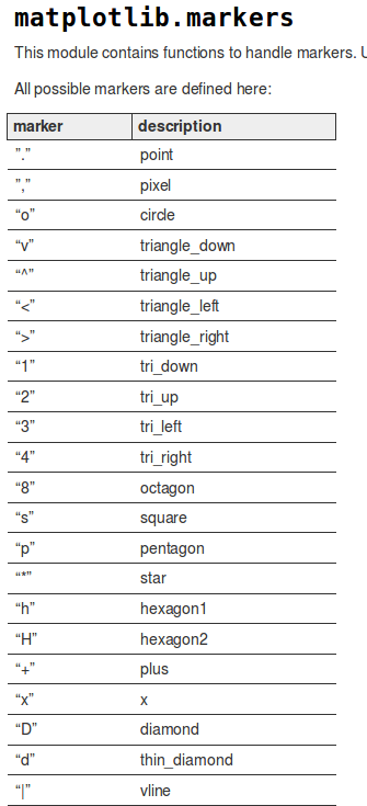
I wondered about how to change the symbol types. I googled
"symbol attributes in matplotlib scatter plot" and found
lots of things, the
second of which was very useful!. For the sake of completeness in my offline
notes, I show a small part of a graphic from that webdoc below:
 |
|
Examples of marker types.
|
Another bothersome python thing: If you
like code that is clear, you might want to use the name for a marker type. Of
course, python would not have this. Colors, that's one thing, but marker
types, no way. So:
These will work:
blue . 5      Blue point of size five.
red  o 10     Red circle of size ten.
g d 12        Green thin-diamond of size twelve

These will fail (in python 2.7):
blue point 5
red  circle 10
g thin_diamond 12       in-diamond of size twelve
Commands which take color arguments can use several formats
to specify the colors. For the basic built-in colors, you
should use a single letter:
        b: blue
        g: green
        r: red
        c: cyan
        m: magenta
        y: yellow
        k: black
        w: white

Gray shades can be given as a string encoding a float in the 0-1 range, e.g.:
  color = '0.75'

For a greater range of colors, you have two options. You can specify the
color using an html hex string, as in:
color = '#eeefff'
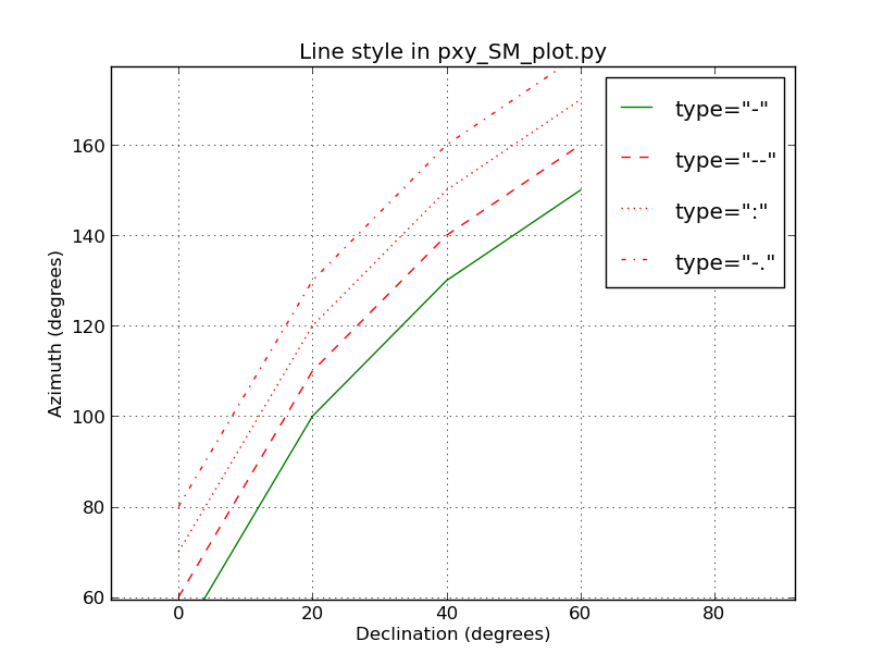
Line types were a little harder to find out about. Python has a jillion options, but
nobody ever lists or expalins more than a few that work. Here are four that work with
the type "line" in my codes:
These will work:
  -
  --
  : -
  .
 |
|
Examples of line style in matplotlib that seem to work in pxy_SM_plot.py (as of Mar2017).
|
Back to calling page