Plotting XY Data From Table Files
We often want to plot X,Y data from a simple file consisting of columns
and rows. Here I discuss some of the tools I use to do this.
- The basic plotting tools.
- A table file and an operation with it.
- A simple interactive XY extraction tool.
- A high-level plotting script.
The basic plotting tools.
I have a variety of plotting tools, but there are two python codes
that I find to be generally the most useful. The first is named
pxy_SM_plot.py and
the second is trs_plot.py.
The "trs_" package is designed for the less general problem of
visuallizing coordinate transformations, but it uses some nice
examples of point labeling and maintaining proper aspect ratio, ect...
and so I mention it here. The links above will give you sample
calls to these codes, but here are two quick examples:
% pxy_SM_plot.py style.hetq-tz 0 360 86 91 SHOW
% cat style.hetq-tz
20160617 ACAM Data
HETQ (HET Parallactic Angle)
tz
UT20160617-hetq-tz.file
UT20160617-hetq-tz.file_1
UT20160617-hetq-tz.file_2

% trs_plot.py Style.file -30 30 -30 30 SHOW
% cat Style.file
X,Y Gaussian Data
X (0.0,5.0)
Y (0.0,12.0)
XY0.rst_plot
I show these mainly to demonstrate how similar the calls are. The
first argument is the name of a file that will specify the style
of the plot (axis labels etc...) and the data files to be plotted.
The next four values are axis limits, and the last argument is used
to indicate wheth you just want a hard copy file or you want to
use the matplotlib show() module to view and adjust the plot after
it is initially generated. In the first example above I am
plotting three sets of X,Y points (in the file UT20160617-hetq-tz.file, etc...)
and in the second case I am plotting a single set (in the file
XY0.rst_plot).
The rest of this document is about how, given a table file, we can
easily set up those Style and XY data filesa to generate a plot.
A table file and an operation with it.
I define a table file to be an ASCII file with a header
section. Some would refer to this as a flat file. I always
offset the header of my files with the "# data" string. Here is
an example of the first protion of a table file.
% head -15 hetAZindo_dec01.dat
Col01 = STRUCTAZ, structure azimuth from header
Col02 = AZfromDEC, azimuth based on declination
Col03 = HETQfromAZ, parallactic angle from structure azimuth
Col04 = HETQfromDEC, parallactic angle from structure azimuth based on DEC
Col05 = DECDEG, declination in degree uni ts
Col06 = STRUCTAZ - AZfromDEC
Col07 = HETQfromAZ - HETQfromDEC
Col09 = side of sky relative to meridian
STRUCTAZ, AZfromDEC, HETQfromAZ, HETQfromDEC, DECDEG, AZdif, HETQdif, direction
# data
	180.00 177.75   180.000 178.060   -4.306543 002.25 001.94  E     20161006T001036.7_acm_sci
	180.00 177.75   180.000 178.060   -4.306543 002.25 001.94  E     20161006T001021.3_acm_sci
	180.00 177.75   180.000 178.060   -4.306543 002.25 001.94  E     20161006T001032.8_acm_sci
	180.00 177.75   180.000 178.060   -4.306543 002.25 001.94  E     20161006T001029.0_acm_sci
	180.00 177.75   180.000 178.060   -4.306543 002.25 001.94  E     20161006T001025.2_acm_sci

The full file is in:  $scohtm/scocodes/XYplots_from_Tables/sample_files/T1
The entire file is about 3600 lines long,so we jsut show the top
of the file above. The job before is to use a tool that lets us
pull columns and build the data files we need for our plot tool.
The first thing we have to do is use a tool to pull the columns we want
to plot from the table file. The python tool
colget.py is good for this. Suppose
I want to plot column 2 of our table (named AZfromDEC) and plot it on the
Y axis as a fuction of column 5 (named DECDEG) on the X axis. With colget.py
I could pull two files, one for each variablem and I can name the files
using the variable name:
% colget.py hetAZindo_dec01.dat 2 AZ1 N
% colget.py hetAZindo_dec01.dat 5 DECDEG N
% ls
AZ1  DECDEG  head.lines  hetAZindo_dec01.dat  S/
% head -5 AZ1
  177.75
  177.75
  177.75
  177.75
  177.75

In this way I can build the file:  dat.1 with my X,Y data:
% head dat.1
point g o 90
AZ(from DEC)
  -4.306543	  177.75
  -4.306543	  177.75
  -4.306543	  177.75
  -4.306543	  177.75

Then I make the style file: stayle.1
$ cat style.1
Sample Azimuth Plot
Declination (degrees)
Azimuth (degrees)
dat.1

Finally I can make my plot!

% pxy_SM_plot.py style.1 -10 89 0 360 SHOW
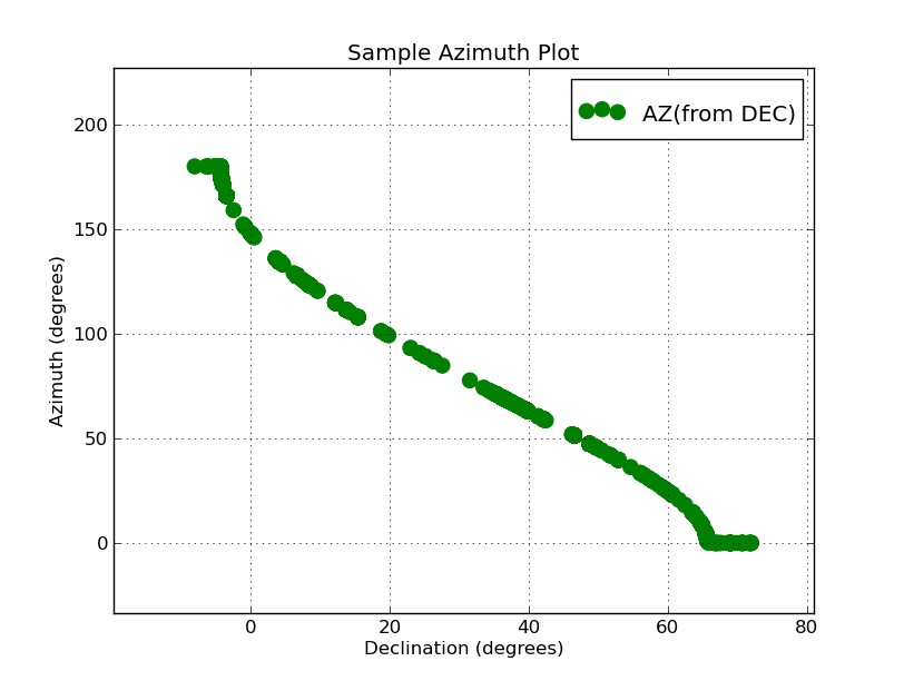
The plot we generate this way is shown below.
 |
|
Here is the plot we have generated with the two columns pulled
from out table file. This plot of approximately 3500 poinst was
generated in a couple seconds (not including the time we used
building the files style.1 and dat.1). My inital Azimuth range
was 0 to 360, but becasue I used the show() module I was quickly
able to interactively reset the axes and make a nicer version
of the plot. Why my azimuths run from 0 to 180 instead of 0
to 360 is another question all together! As a result of this
little plot, I could quickly see that I had lost my Azimuth values
between 180 and 360. I went to my routine "estimate_azhet_hetq" and
quickly located the trouble: another misssed dollar sign
in front of a variable name. But, the problem is now fixed!
|
A simple interactive XY extraction tool.
The example in the previous section explains how things are
done, but it is not very practical. What we want is a way to quickly
extract columns from a file and build the plot file we need
for pxy_SM_plot.py.Here is an easy-to-use tool for this:
% xy_from_table hetAZindo_dec01.dat 5 1

* You are queried for the symbol style, marker symbol, color, etc...
* the product is a file named XY.plot that can be fed to pxy_SM_plot.py
With this utility I could pretty quickly assemble plot files from a
large, complicated table file (or files). With this I re-did the
plot in the previous section after I had fixed the azimuth problem.
Also, I was able to grab the AZSTRUCT values from headers and plot
those with a different symbol.
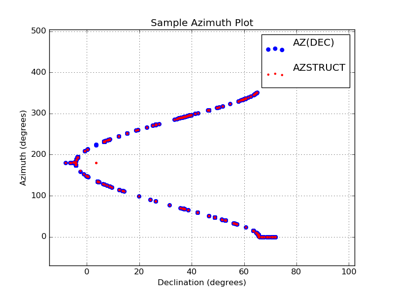 |
Here is the plot from the previous section where I have now fixed
my azimuth problem. I have also added the AZSTUCT values obtained
from ACAM images (these are plotted as small red dots). The plot
files were easily generated with the script xy_from_table. The
commands I used were:
% xy_from_table hetAZindo_dec01.dat 5 1
% xy_from_table hetAZindo_dec01.dat 5 2
**** I manually create the style.1 file ****
% pxy_SM_plot.py style.1 -10 89 0 360 SHOW
Again, I note that I changed the plot limits on each axis using the
show() module. The values at high azimuth were running in the point
legend in the upper-right of the plot. With show() is was trivial
to correct this on the fly.
|
Finally, I'll mention that "xy_from_table" has a little trick built in.
You can read the plot info automatically if you build a local file
named "xy_from_table.input" that has the necessary parameters written to it.
This is not terribly useful for a single manual run, but as we'll see in
the next section, it can be very useful for building a higher-level tool.
Here is an example of using this mode:
% cat xy_from_table.input
point r o 50 "My Comment"

[sco@mcs T1]$ xy_from_table hetAZindo_dec01.dat 5 1

[sco@mcs T1]$ head -5 XY.plot
point r o 50
"My Comment"
  -4.306543	  180.00
  -4.306543	  180.00
  -4.306543	  180.00
As you see, there are no interactive queries. You just get your
plot file (XY.plot) right after the call. Now we could build something
that would make repeated calls to xy_from_table, build our style file, and
finally run our pxy_SM_plot.py code for us. Not terribly trivial, but a
heck of lot easier than the manual procedures we've been using thus far.
A high-level plotting script.
I have developed a fairly simple script for doing all of the tasks discussed above.
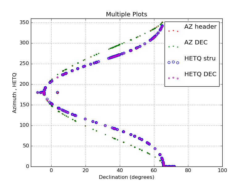 |
I have plotted four rather large data sets from a single ASCII
file using the "xyplotter" code.
[sco@mcs T1]$ cat List.axes
Multiple Plots
-12  100   Declination (degrees)
  0  360   Azimuth , HETQ

[sco@mcs T1]$ cat List.1
hetAZindo_dec01.dat  5  1   point r . 10    AZ header
hetAZindo_dec01.dat  5  2   point g . 10    AZ DEC
hetAZindo_dec01.dat  5  3   pointopen b o 30    HETQ stru
hetAZindo_dec01.dat  5  4   pointopen m h 10    HETQ DEC

NOTICE: I use a new point type = pointopen

[sco@mcs T1]$  xyplotter List.1 List.axes

final plot was made with:
[sco@mcs T1]$ pxy_SM_plot.py STYLE -12 100 0 360 SHOW
This plot took just a few seconds to display.
|
In developing thios script I found that I needed a way to make open symbols
(i.e. an open circel as opposed to a solid filled circle). The filled points
(type=point in xyp_SM_plot.py) can often overlap one another and make it
difficult to see all of the points. I modified xyp_SM_plot.py to use open
poinst and, as you can see in the example above, these help considerably
when you have a large number of data points.
Back to calling page