 |
An example of a plot I made with the command line:
pxy_SM_plot.py style.hetq-tz 0 360 86 91 SHOW |
This is a plotting package that uses the MATLAB-like plotting package matplotlib.pyplot. I never use MATLAB, but the pyplot documentation seems to be pervasive, especially among astronomers. As of August 2016 I can plot data points, lines and error bars. I can direct the plot to a hardcopy file (named pxy.png) or I can specify that each plot go to the interactive show() gui. Note that this routine is rarely used directly from the command line. Rather, I run it is more-friencly scripts like xyplotter_auto or xyplotter.
I wrote a script named mpl that provides a brief summary of point type a color properties.
%  pxy_SM_plot.py --help
usage: pxy_SM_plot.py [-h] [-v] arg1 arg2 arg3 arg4 arg5 arg6

positional arguments:
  arg1           input data file
  arg2           low value for X axis
  arg3           high value for X axis
  arg4           low value for Y axis
  arg5           high value for Y axis
  arg6           display method = HARD or SHOW

optional arguments:
  -h, --help     show this help message and exit
  -v, --verbose  Verbose responses
The last argument specifies whether I want to display the plot interactively (with show()) or just send the plot to a hard-copy file named pxy.png. As of Aug2016, this code will plot points, lines, and errorbars. I show a basic example below.
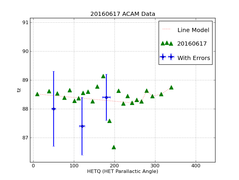
To interactively view the plot:
%  pxy_SM_plot.py style.hetq-tz 0 360 86 91 SHOW

To directly make a hardcopy:
%  pxy_SM_plot.py style.hetq-tz 0 360 86 91 HARD

The input files I use are:
style.hetq-tz ===> Give axis labels and lists the data sets to be plotted.

% cat style.hetq-tz
20160617 ACAM Data
HETQ (HET Parallactic Angle)
tz
UT20160617-hetq-tz.file
UT20160617-hetq-tz.file_1
UT20160617-hetq-tz.file_2

Possible type of marking:    point , line, errorbar


% cat UT20160617-hetq-tz.file
point g ^ 90        # type of marking, color, marker code, size
20160617            # label name
9.864	88.510
38.954	88.609
59.190	88.531
76.780	88.383
89.806	88.644
.....
279.311	88.628
293.520	88.437
315.167	88.507
340.091	88.742

Here I plot a line or curve:
% cat UT20160617-hetq-tz.file_1
line r : 30
Line Model
9.864	88.510
243.402	88.205
254.989	88.307
266.616	88.254
279.311	88.628
293.520	88.437
315.167	88.507
340.091	88.742

Here I plot points with error bars:
% cat UT20160617-hetq-tz.file_2
errorbar b o 100
With Errors
50.0  5.0    88.0 1.3
180.0 10.0   88.4 0.8
120.0 7.0   87.4  1.0
Below I show the plot I made with these data files when I used the "SHOW" mode. I adjusted the axis properties a little and then made a hardcopy file with a custon name. I show the file below.
|
An example of a plot I made with the command line:
pxy_SM_plot.py style.hetq-tz 0 360 86 91 SHOW |
We can plot a variety of marker and line types. I got some of these simple commands from a somewhat useful pyplot tutorial in the online matplotlib docucumentation. Note that I added a lot of things by adding just a few lines to the procedure. One thing to now that that instead of using plt.scatter() to plot points, I use the plt.plot() command. I specify that red dots are to be plotter using the 'ro' argument. I'll nver remember that bullshit, but here is a simple table:
Other options for the color characters are:
 'r' = red
 'g' = green
 'b' = blue
 'c' = cyan
 'm' = magenta
 'y' = yellow
 'k' = black
 'w' = white

Options for line styles are
 '-' = solid
 '--' = dashed
 ':' = dotted
 '-.' = dot-dashed
 '.' = points
 'o' = filled circles
 '^' = filled triangles

The other thing to do (in ipython) to get a load of information:
In [33]: plt.plot?

When I did this I got a bigger chart:

The following color abbreviations are supported:
==========  ========
character   color
==========  ========
'b'         blue
'g'         green
'r'         red
'c'         cyan
'm'         magenta
 'y'         yellow
'k'         black
'w'         white
==========  ========


================    ===============================
character           description
================    ===============================
``'-'``             solid line style
``'--'``            dashed line style
``'-.'``            dash-dot line style
``':'``             dotted line style
``'.'``             point marker
``','``             pixel marker
``'o'``             circle marker
``'v'``             triangle_down marker
``'^'``             triangle_up marker
``'<'``             triangle_left marker
``'>'``             triangle_right marker
``'1'``             tri_down marker
``'2'``             tri_up marker
``'3'``             tri_left marker
``'4'``             tri_right marker
``'s'``             square marker
``'p'``             pentagon marker
``'*'``             star marker
``'h'``             hexagon1 marker
``'H'``             hexagon2 marker
``'+'``             plus marker
``'x'``             x marker
``'D'``             diamond marker
``'d'``             thin_diamond marker
``'|'``             vline marker
``'_'``             hline marker
================    ===============================
The thing to notice is that you can use the marker types above to specify whether you want LINES or MARKERS. I can do most of what I usually need using plt.plot() alone! And Finally: A very nice feature about using the "plt.show() command is that the legends stay in place. You can use the arrow box icon to change the scale and placement of your points in the plot, but if you used loc=3 in the setting up the legen location, then that legend box STAYS in the lower-left corner. This is a nice feature and one I wish I had known about long ago!