TRS Demsonstration 1
Trge TRS routine generally take as input a list of X,Y values
in a file that has a "# data" header. In this document I
demonstrate how to use most of the suite of trs_ routines.
- Generate and plot a test data set.
- Translation.
- Scaling.
- Rotation.
- Putting things together to solve for a transformation.
- Plotting.
Generate and plot a test data set.
One of the first things we need to be able to do is generate a
file of XY data. We'd like to be able to plot this data. I cobbled
togtehr some tools for this:
- trs_make_xy_TestData is a script that uses the gen_noise.sh
routine to create X,Y values drawn from gaussian noise,
- trs_plot.py is a python code that plots the X,Y data. We can
use this routine to plot many of the subsequent steps in this exercise, so
I'll discuss this routine in some detail here.
Below I show how I generate a typical set of XY data. Not that
the last line output from this script tells you how to run
the plotting step:
% trs_make_xy_TestData
Usage: trs_make_xy_TestData 7 0.0 5.0 0.0 12.0 s
arg1 - number of points
arg2 - mean of gaussian 1
arg3 - sigma of gaussian 1
arg4 - mean of gaussian 2
arg5 - sigma of gaussian 2
arg6 - point symbol for pxy_SM_plot.py file


% trs_make_xy_TestData 7 0.0 5.0 0.0 12.0 s

	To plot this data:
	trs_plot.py Style.file -30 30 -30 30 SHOW

# This creates four files:
PointNames   == lists the integer names of the 7 points
Style.file   == specifies the format of the plot to be made and which file(s) will be plotted
XY0.data     == the XY data (that can be fed to various trs_ scripts)
XY0.plot     == same as above with some additional plot formatting info (point type, color, size, etc....)


% trs_plot.py Style.file -30 30 -30 30 SHOW
After I executre the last plot command (i.e. trs_plot.py) above, I see a plot window (from
the pmatplotlib plt.show() finction). I can use this window to adjust the
plot formatting and generate a hard copy. One important point here is that I
wrote trs_plot.py with a specific point in mind for XY transformation work: I
always want to view the XY plots with an aspect ratio of 1. This makes calculation
offsets and rotation angles much easier! Below I show the plot I get by unning trs_plot.py:
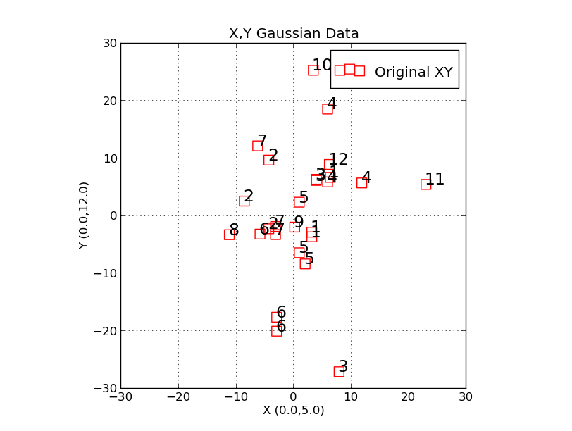 |
A sample plot of XY data generated with trs_make_xy_TestData. The
trs_plot.py is used to generate this plot. The command I used to
make the plot was:
% trs_plot.py Style.file -30 30 -30 30 SHOW

Here are the two files involved:

% cat Style.file
X,Y Gaussian Data
X (0.0,5.0)
Y (0.0,12.0)
XY0.rst_plot

% cat XY0.rst_plot
point r s 100 17
Original XY
3.21613	8.14870	1
-4.25865	13.26767	2
3.97464	-1.07678	3
5.95120	9.58445	4
1.02907	17.76330	5
-2.89824	-21.74959	6
-3.09813	13.18073	7
|
It will be useful to say a few words here about the plotting tool. The first
file (Style.file) just contains the plot tile and axis labels. Next, the plot
files are listed. We can plot multiple data sets, and this will be very useful
for the present exercise. The next thing to ask is: How do I change the
properties of the plotted data poiints? The first line of each point file
(our one file here is "XY0.rst_plot") specifies this information. There are
5 entries on this line:
Entry1 == the type of thing to be drawn (we use "point" for all trs_ work)
Entry2 == point type specifier (single character, examples = "s" for square, "o" for circle, ...)
Entry3 == point color specifier (single character, examples = "r"  for red, "b" for blue, ...)
Entry4 == size of point specifier (integer, 100 is a good value)
Entry5 == size of Text that labels each point (integer, 16 is a good value)
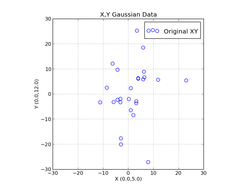 |
|
This is the same data we have plotted above. The only thing we did was change
the first line in the "XY0.rst_plot". We change the point type to a circle ("o")
and the point color to blue ("b") and we changed the size of the Text labeling
to 0 (no labeling).
|
That's it really! We'll see in the next sections how we can use this
simple plotting approach to demo the different operations. Labeling the
points with names (usually just the line number of the X,Y pair in the
input file) will help us visualize the type of transformation we have
performed. We can plot multiple sets in one run, and we can easily
change the point properties.
It is helpful to see one last example: generating and plotting multiple sets. I
can run the trs_make_xy_TestData script twice and generate two different sets. If
I rename the XY0.plot each time, and add this name to the Style.file then I can plot
both sets at once. In fact, this is how we'll demonstrate the various transformations
discussed below. If I edit the XY0.plot files I can easily change the point types used
in plotting the data points. The figure below shows an example of this process.
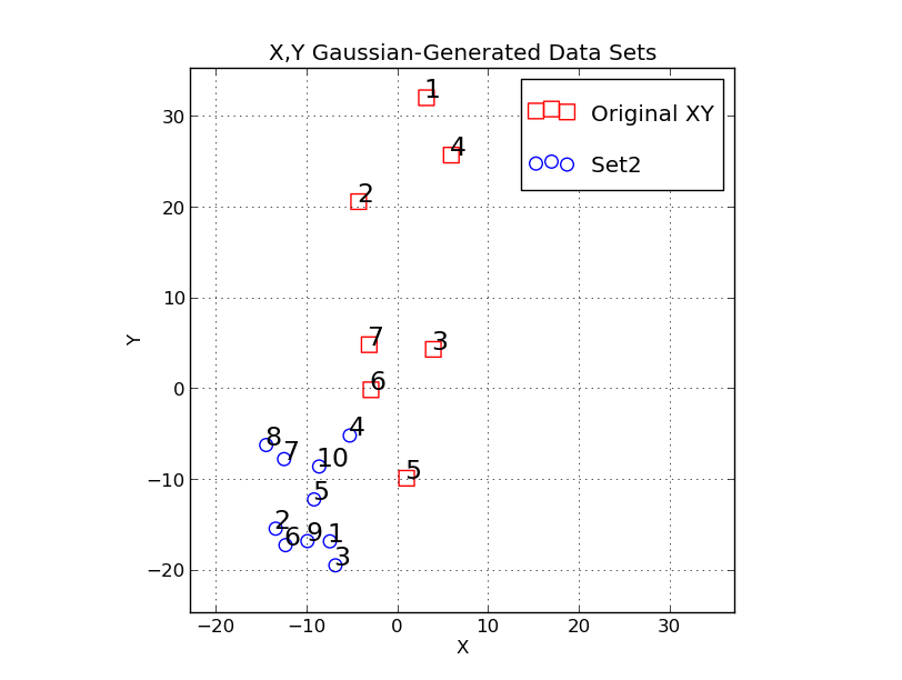 |
An example where we plot the data set from above and an additional data set
generated in the same way but with a few input parameters changed.
We generate the two data sets (renaming each one)

  trs_make_xy_TestData 7 0.0 5.0 0.0 12.0 s
  mv XY0.plot XY0.plot_1
  trs_make_xy_TestData 10 -10 4 -12 5 o
  mv XY0.plot XY0.plot_2
  vi XY0.plot_2
  vi Style.file
 I changed the axis labeling, and I change the names of the files to plot.
  trs_plot.py Style.file -30 30 -30 30 SHOW
|
One thing I did above (that is not covered in the caption) is that I edited the
second file (XY0.plot_2) so that the points from there were plotted as blue circles.
Finally, we'll see in the next section that we could use only the *.data fiiles. Instead
of manually running vi to change the properties of the plot files (like XY0.plot_2) we can
use the script named "trs_build_plot_file" to generate the plot files on the fly.
translation.
Here we'll apply an offest in X,Y. This is usually the firt
step in transforming one data set to the coordinate system
defibned by another: we change the origin. We'll translate the
points in our data set from above, we'll make the plot files
for these new sets, then we'll make a new plot that shows
all three sets:
We perform the translations:
% trs_translate.sh XY0.data 10 5 > XY1.data
% trs_translate.sh XY0.data -10 0 > XY1a.data

We build the plot files:
% trs_build_plot_file XY1.data b s 100 10 Translate > XY1.plot
% trs_build_plot_file XY1a.data g h 90 0 "Another set" > XY1a.plot

I add the two new plot files to my "Style.file" file:
% cat Style.file
X,Y Gaussian Data
X (0.0,5.0)
Y (0.0,12.0)
XY0.rst_plot
XY1.plot
XY1a.plot

Finally, I make the new plot:
% trs_plot.py Style.file -30 30 -30 30 SHOW
Notice that I used the very same command as in the prvious section
to make the plot. The plot I got is shown below. It is worth noting
that some of my translated points ended up being located under
the legend box in the upper-right corner of my plot. Becasue I
was using the "plt.show()" tool, I could easily move the plot around
(retang the aspect=1 axis ratio) to uncover them.
 |
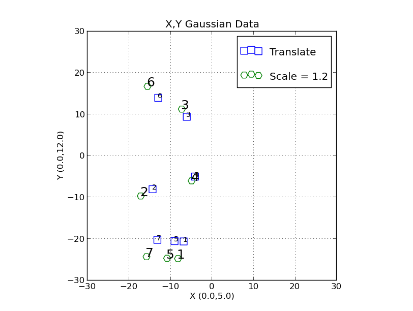
The data set shown above along with two new point sets
obtained by translation with "trs_translate.sh".
Perform the translations:
% trs_translate.sh XY0.data 10 5 > XY1.data
% trs_translate.sh XY0.data -10 0 > XY1a.data
Build the plot files:
% trs_build_plot_file XY1.data b s 100 10 Translate > XY1.plot
% trs_build_plot_file XY1a.data g h 90 0 "Another set" > XY1a.plot
|
Scaling.
Now we'll apply a scale factor to each of the X and Y axes:
%  trs_scale.sh XY1.data 1.2 > XY2.data
%  trs_build_plot_file XY2.data g H 100 18 "Scale = 1.2" > XY2.plot
The results of our scaling are shown below. Notice that we
have scaled everything relative to the new origin (after our
translation procedure in the previous section).
 |
Our tranlated set from theprvious section and our newly
scaled set.
Perform the translations:
% trs_scale.sh XY1.data 1.2 > XY2.data
% trs_build_plot_file XY2.data g H 100 18 "Scale = 1.2" > XY2.plot
|
Rotation.
Now we'll apply a rotation to the XY points. Note that this trs_ script assume
that the rotation center is at the current origin of the X,Y set (i.e. X,Y = 0,0).
% trs_rotate.sh XY2.data 30.0 > XY3.data
% trs_build_plot_file XY3.data r o 120 22 "Rotate=30deg" > XY3.plot
The results of our rotation are shown below. Notice that we
have rotated everything relative to the origin (0,0).
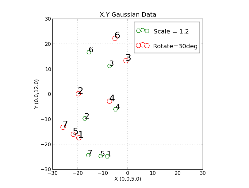 |
Our tranlated and scaled set from the previous section and our newly
rotated set.
Perform the translations:
% trs_rotate.sh XY2.data 30.0 > XY3.data
% trs_build_plot_file XY3.data r o 100 18 "Rotate=30deg" > XY3.plot
|
I have composed a special doc concerning the
rotation angle derivations.
Putting things together to solve for a transformation.
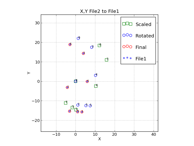
Here is an early script to walk through a transformation.
We'll use the point (point 2) to define the origin.
% ls
PointNames  XY0.data  XY3.data

XY0.data = my original test data file
XY3.data = XY data after I have tranlated, scaled and rotated it.

% trs_solve_1 XY0.data XY3.data 2

file1,file2,pointnum = XY0.data XY3.data 2
Enter any key:

X,Y from file 1 = -4.25865 -3.15645
X,Y from file 2 = -19.712 0.080
Derived scale = 0.83331   m.e.=0.00002    N=6

Enter rotation angle in degrees (-30.0): -30.0

Enter final Xo,Yo (negative of file 1 X,Y): +4.26 +3.16

	To plot this data:
	trs_plot.py Style.file -30 30 -30 30 SHOW
The results of our rotation are shown below.
 |
|
The points go back to the file1 system.
|
Plotting.
A lot of usesful plotting approaches are available. So many, in fact, that I can never
rememeber how this stuff works! In an effort to put some order to this I have prepared
a general document on TRS-related plotting.
Back to calling page