Plotting and fitting XY data
Plotting and fitting XY data
Updated: Jul27,2020
Here I describe ways to plot data with the matplotlib module of python. Some useful links
are given below, but the basic high-level plotting tool I am using now is
xyplotter_auto. This tool lets you plot multiple
sets of data from different table files. There are some easy-to-follow
examples in the xyplotter_auto link just given that will demonstrate how to plot data from
a table file. This is the definitive documentaion point for
xyplotter_auto as I am usually always updating the contents of that link.
- Plotting and fitting a line using a table file.
- What are cdfp and table files?
- Early python plotting examples.
- Archival notes from early work.
- Appendix
Plotting and fitting a line using a table file.
I have gathered a a simple table file that I use here to plot and then
fits a line with. The interactive responses are fairly obvious, and I concentrate
here on showing the command lines and the resulting output files. I show the final
plot with the data and fitted line at the end of this section.
Here is the table file:
% cat mag_diam.parlab
mag      USNO Red Magnitude
rad      Radius in pixel units
lograd   log10(Radius in pixel units)
name     Line Number Name

% cat mag_diam.table
# data
 17.37   7.00    0.845098    11
 12.82   20.41   1.309843    13
 16.72   7.14    0.853698    19
 14.60   12.03   1.080266    23
 14.57   12.13   1.083861    24
 18.13   3.90    0.591065    27
 14.18   13.37   1.126131    30
 19.43   6.03    0.780317    31
 16.81   6.62    0.820858    40
 15.86   11.81   1.072250    5
 16.87   8.23    0.915400    6
 19.91   5.82    0.764923    7
 19.47   5.90    0.770852    43
 16.60   10.42   1.017868    48

# Set up a generic set of plot parametes in a local file = xyplotter_auto.pars
% Generic_Points N
Mfont color=green># Sjow some useful plot package info
% mpl

# make the initial plot of the data
% xyplotter_auto mag_diam mag lograd 1 N

I get two primary files:
% cat List.1
mag_diam.table 1 3 0 0   point  b o 5  Pixels
% cat Axes.1
Magnitude-Diameter data fron an acm i image
  12.82000 19.91000 USNO Red Magnitude
  0.59106 1.30984 log10(Radius in pixel units)

# fit the data (I use  curve type = "line")
% curve_runner 1 N

Here is the file set I get:
% cat List.1
mag_diam.table 1 3 0 0   point  b o 5  Pixels
line.fitcurve.1 1 2 0 0   line  r - 10  Iter1
line.fitcurve.2 1 2 0 0   line  c - 10  Iter2
% cat Axes.1
Magnitude-Diameter data fron an acm i image
  12.82000 19.91000 USNO Red Magnitude
  0.59106 1.30984 log10(Radius in pixel units)
This made a pretty good looking plot. I sometimes modify the List amd Axes
files to change the format slightly and then replot the figure with
xyplotter. I show and example of this
below and the final plot that results. BTW, I can never remember the point and line
types, etc.... that are in files like "List.1". All of that crap can be quickly
recalled using the mpl that I showed above.
% cat List.1
mag_diam.table   1 3 0 0   point  b o 50  acm i
line.fitcurve.1  1 2 0 0   line   r - 10  Fit1
line.fitcurve.2  1 2 0 0   line   c - 10  Fit2
% cat Axes.1
Magnitude-Diameter data acm i image
  12.00  21.00     USNO Red Magnitude
  0.40   1.50      log10(Radius in pixel units)

% xyplotter List.1 Axes.1 N
 |
|
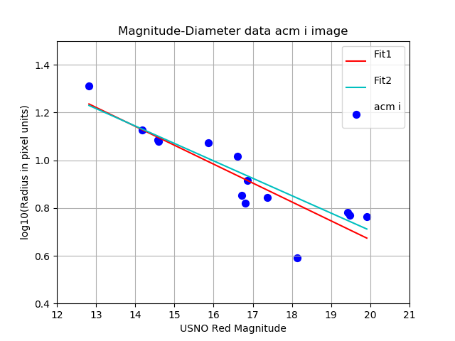
The xyplotter_auto and curver_runner routines were used to fit a
line to 14 points of magnitude,diameter data in a tbale file. The
red line (Fit1) is the fit to all of the data points. After rejecting
a single point in a 2.5 sigma rejection cycle, we see the final fits
(Fit2) ias the cyan line.
|
Return to top of page.
What are cdfp and table files?
A "tabla file" is a file of rows and colums, with an accompanying file that explains
what is in each column. In many cases, the table file is accopmanied by a "parameter
names" file which gives a short name for each column in the table (as opposed to a
long comment line). The data column can be composed of numeric or string data. Below
I show the typical examples of a table file with basename "BulgeDisk":
% cat BulgeDisk.parlab
ring      profile point number
r         Radius
r25       Radius**1/4
I_B       Intensity of Bulge Component
I_D       Intensity of Disk Component
I_BD      Intensity of Bulge+Disk
logI_B    log(Intensity Bulge)
logI_D    log(Intensity Disk)
logI_BD   log(Intensity Bulge+Disk)

% cat BulgeDisk.table
# data
   1       0.00    0.00000  2141410.5000     100.0000 2141510.5000     6.3307    2.0000    6.3307
   2       0.20    0.67042    43053.1055      98.0001   43151.1055     4.6340    1.9912    4.6350
   3       0.40    0.79727    20557.8496      96.0401   20653.8906     4.3130    1.9825    4.3150
   4       0.61    0.88233    12523.4248      94.1194   12617.5439     4.0977    1.9737    4.1010
   5       0.81    0.94812     8535.1309      92.2371    8627.3682     3.9312    1.9649    3.9359
Notice that sometimes I have codes that search for a parameters file. This is a
file (e.g. BulgeDisk.params) that lists the short parameter names (the first
column of BulgeDisk.parlab).
A cdfp file (CoorDinate Floating Point) is a specialized file I use for coordinate-related
jobs. The first line is always a single string of header information. The columns of data
are all numeric, and the first two columns are always the RA in hours and
the DEC in units of degrees (both in floating point format).
Return to top of page.
Early python plotting examples
Early python plotting examples.
I used a variety of matplotlib methods in my early python days.I have collected
some of source code from these python
plotting examples. Examples of plotting text label or shading points are
included there.
Return to top of page.
Archival notes from early work.
This document was heavily revised in Oct2018. The nitty-gritty of my earliest plotting
tools are archived in some Pre-2018 notes.
Return to top of page.
Appendix
Here I collect some hopefully useful explanations and examples.
- File type terminology
- Compute column statistics.
- Colors, marker and line types
File type terminology.
Basic types of plots:
I presently plot data using 4 basic types. I use longer, mor explanatory names
for the pxy_SM_plot.py code, but short name designations for the xyplotter_auto
code. The xyplotter_auto ultimately uses pxy_SM_plot.py to build the plot, but this
is a wrapper code built for speed and concenience.
   pxy_SM_plot.py         xyplotter_auto
   --------------         --------------
       point                    P
       pointopen                OP
       errorbar                 E
       line                     L
table file:
This is a file that contains multiple columns and rows of data. The
data maybe text-based or numerical. The will be some marker (i.e.
"# data" that indicates when the data portion of the file begins.
Everything before that will usually be free-format header information.
% head -15 hetAZindo_dec01.dat
Col01 = STRUCTAZ, structure azimuth from header
Col02 = AZfromDEC, azimuth based on declination
Col03 = HETQfromAZ, parallactic angle from structure azimuth
Col04 = HETQfromDEC, parallactic angle from structure azimuth based on DEC
Col05 = DECDEG, declination in degree uni ts
Col06 = STRUCTAZ - AZfromDEC
Col07 = HETQfromAZ - HETQfromDEC
Col09 = side of sky relative to meridian
STRUCTAZ, AZfromDEC, HETQfromAZ, HETQfromDEC, DECDEG, AZdif, HETQdif, direction
# data
        180.00 177.75   180.000 178.060   -4.306543 002.25 001.94  E     20161006T001036.7_acm_sci
        180.00 177.75   180.000 178.060   -4.306543 002.25 001.94  E     20161006T001021.3_acm_sci
        180.00 177.75   180.000 178.060   -4.306543 002.25 001.94  E     20161006T001032.8_acm_sci
        180.00 177.75   180.000 178.060   -4.306543 002.25 001.94  E     20161006T001029.0_acm_sci
        180.00 177.75   180.000 178.060   -4.306543 002.25 001.94  E     20161006T001025.2_acm_sci
I usually try to describe the contents of each colum in a table file in
the way above, but this is nit a rewirement. The only hard requirement for
most of my software tools that that there be a "# data" line that indicates
where the table data begins. I should note that the format of the above
tabkle is nice and neat: the columns are all aligned and easy to follow
with the ey when you read it. The software does not care about this. All it
wants is blank space betwwen column entries.
style file:
This is a file usually used with plooting tools (like pxy_SM_plot.py) to
specifiy the labels that fo on the plot axes. I also specifies the
names of the plot data files that will supply the(X,Y) values that will be plotted.
Here is an example (the style file we used for the first example in this doc):
% cat style.hetq-tz
20160617 ACAM Data
HETQ (HET Parallactic Angle)
tz
UT20160617-hetq-tz.file
UT20160617-hetq-tz.file_1
UT20160617-hetq-tz.file_2
The first three lines are the plot title, the X-axis label, and the Y-axis label.
The next three lines are the names of the data point files to be plotted.
data point file:
These files contain the X,Y data we are going to plot. The first
line of a data point file is describes how the points will be plotted.
Below we see that we'll plot a red (r) line, with a dashed format (:),
and line thickness of 30. Were we using a point, then th last argument
would specify the point size to used. The second line contains a
descriptive label for the data set. This is the string that will be
painted in the plot legend placed in the upper-right corner of the plot.
You want this descriptive title to be short. All of the remaining lines
are the X,Y data line. Note that the format of the data lines can change depending
on the type of data being plotted. I show a second example below of the file
we used to plot points with error bars in our first sample plot of this doc.
The type of thing being plotted is "errorbar", and hence we need four numbers
per point: X, the error of X, Y, the error of Y.
% head UT20160617-hetq-tz.file_1
line r : 30
Line Model
9.864   88.510
243.402 88.205
254.989 88.307
266.616 88.254
279.311 88.628
293.520 88.437
315.167 88.507
340.091 88.742

% head UT20160617-hetq-tz.file_2
errorbar b o 100
With Errors
50.0  5.0    88.0 1.3
180.0 10.0   88.4 0.8
120.0 7.0   87.4  1.0
Compute column statistics
Often we'll have information in the column of a table file that we wish
to summarize with some simple statistics.
% calstats.py Az1
223.24486 90.64843 0.00000 351.27000 236.495000 3536 1.524634

% calstats.py -v Az1
223.24486 90.64843 0.00000 351.27000 236.495000 3536 1.524634
(mean,std,min,max,median,Npnts,m.e.)

Simple stats for numbers in: Az1
Mean                     = 223.24486
Median                   = 236.49500
Standard deviation       = 90.64843
Minimum                  = 0.00000
Maximum                  = 351.27000
Number of values         = 3536
Mean error of then mean  = 1.52463
Of course, the user has to know enough to pull the proper column, and that
column must be be comprised of numerical data.
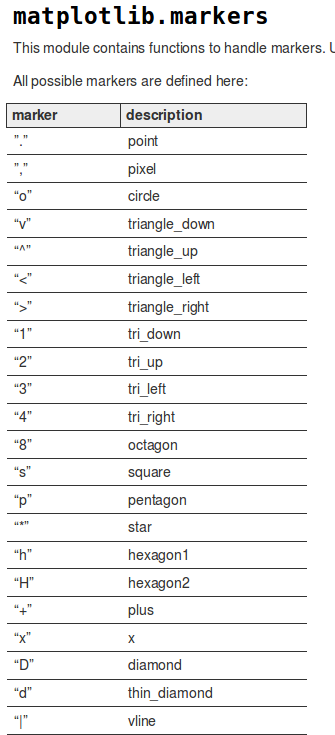
Colors, marker and line types
I wrote a script named mpl that provides a
brief summary of point type a color properties.
I wondered about how to change the symbol types. I googled
"symbol attributes in matplotlib scatter plot" and found
lots of things, the
second of which was very useful!. For the sake of completeness in my offline
notes, I show a small part of a graphic from that webdoc below:
 |
|
Examples of marker types.
|
Another bothersome python thing: If you
like code that is clear, you might want to use the name for a marker type. Of
course, python would not have this. Colors, that's one thing, but marker
types, no way. So:
These will work:
blue . 5      Blue point of size five.
red  o 10     Red circle of size ten.
g d 12        Green thin-diamond of size twelve

These will fail (in python 2.7):
blue point 5
red  circle 10
g thin_diamond 12       in-diamond of size twelve
Commands which take color arguments can use several formats
to specify the colors. For the basic built-in colors, you
should use a single letter:
        b: blue
        g: green
        r: red
        c: cyan
        m: magenta
        y: yellow
        k: black
        w: white

Gray shades can be given as a string encoding a float in the 0-1 range, e.g.:
  color = '0.75'

For a greater range of colors, you have two options. You can specify the
color using an html hex string, as in:
color = '#eeefff'
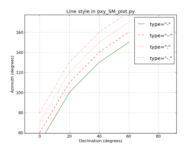
Line types were a little harder to find out about. Python has a jillion options, but
nobody ever lists or expalins more than a few that work. Here are four that work with
the type "line" in my codes:
These will work:
  -
  --
  : -
  .
 |
|
Examples of line style in matplotlib that seem to work in pxy_SM_plot.py (as of Mar2017).
|
Back to calling page