 |
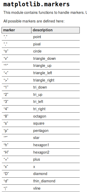
| Examples of marke types. |
This document (begun in Apr2017) started with some notes on the python code I wrote called pxy_S_scat.py, which describes a simple way to plot a SINGLE set of X,Y points. Another useful document called pxy_SM_scat.py, describes a simple way to plot MULTIPLE sets of X,Y points. I found myself refering to these a lot, and I also found that sometimes it took a while to remember where they were (and what their names are!), so I collected the links here in this summary page.
Here I do some exercises to resolve a lot of matplotlib questions that I have had. These are included in my $tdata directories (including the short pieces of source code). I have added some other data files for plotting spectra and AIP fiber data. All of these plots use different features and so it is useful to display the source code here.
I wondered about how to change the symbol types. I googled
"symbol attributes in matplotlib scatter plot" and found
lots of things, the
second of which was very useful!. For the sake of
completeness in my offline notes, I show a small
part of a graphic from that webdoc below:
|
| Examples of marke types. |
These will work:
blue . 5      Blue point of size five.
red  o 10     Red circle of size ten.
g d 12        Green thin-diamond of size twelve

These will fail (in python 2.7):
blue point 5
red  circle 10
g thin_diamond 12       in-diamond of size twelve
For color specification:
Commands which take color arguments can use several formats
to specify the colors. For the basic built-in colors, you
can use a single letter:

        b: blue
        g: green
        r: red
        c: cyan
        m: magenta
        y: yellow
        k: black
        w: white

Gray shades can be given as a string encoding a float in
the 0-1 range, e.g.:

  color = '0.75'

For a greater range of colors, you have two options. You can
specify the color using an html hex string, as in:

color = '#eeefff'
As for making legends, a place to read some (as usual) not very clear text is the matplotlib documentation for matplotlib.pyplot.legend . After some horsing around, I was able to use this documentation to change the location of my legend box.
cd $tdata/T_runs/pxy_S_scat.py/ex1/legend_playI start with using a file that has 4 columns of numerical data (dat.4cols) and show how I can get different symbols and a legend.
To run the code:
% plot_4table.py dat.4cols 0 7 0 70

% cat dat.4cols
1.0  22.0  28.0  57.0
2.0  42.0  33.0  55.0
3.0  12.0  39.0  51.4
4.0  42.0   3.0  41.0
5.0  19.0  53.0  37.0
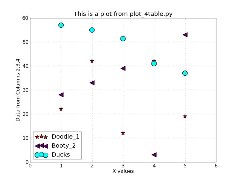 |
My first simple plot example using multiple point symbols. I
used the line:
plt.legend(loc='lower left')to make a symbol legend and locate it in the lower-left corner of the plot.
The full source code for this is shown below:


#!/usr/bin/python
# Usage:   plot_4table.py dat.1 -1 10 -4 22

# Setup to read the name of the input file
from sys import argv
script_name, infile, xlo, xhi, ylo, yhi = argv

import matplotlib.pyplot as plt

label_main  = "This is a plot from plot_4table.py"
label_xaxis = "X values"
label_yaxis = "Data from Columns 2,3,4"
# Read a 4-column file
f = open(infile, 'r')
# initialize some variable to be lists:
x1 = []
y1 = []
y2 = []
y3 = []


# read each data line and load the data lists x1,y1,x1err,y1err
npoints = 0
for line in f:
#    line = line.strip()
    p = line.split()
    x1.append(float(p[0]))
    y1.append(float(p[1]))
    y2.append(float(p[2]))
    y3.append(float(p[3]))
    npoints = npoints+1
f.close()

# Plot the data
plt.scatter(x1, y1, marker="*", c="r", s=100, label="Doodle_1")
plt.scatter(x1, y2, marker="<", c="#5C005C", s=120, label="Booty_2")
plt.scatter(x1, y3, marker="8", c="cyan", s=150, label="Ducks")

# add some fancy touches
plt.grid(True)
plt.legend(loc='lower left')

# label the axes
plt.title(label_main)
plt.xlabel(label_xaxis)
plt.ylabel(label_yaxis)

#plt.show()
plt.savefig('pxy.png')
print '\nUse to view your plot:\ndisplay pxy.png\n'
|
I needed a way to plot some simple ASCII file with Cure spectra (lambda,signal). The test data for this is in $tdata/T_runs/spectra_1/ex0/S. The source code was in codes/python/plotting/vp_spec.
I take the FITS-format 1-d spectrum files (from fiberextract)
and convert it to a simple lambda,flux ASCII file. Then
I plot that spectrum.

To extract the ascii file named Spec.text
% getspec_from_fits.py FeSpesvp8303.fits Spec.text

To plot the spectrum:
% vp_spec.py Spec.text 3800 4200 -30 200
   arg1 = name of input ascii file
   arg2 = lo X value
   arg3 = hi X value
   arg4 = lo Y value
   arg5 = hi Y value

% display spectrum.png
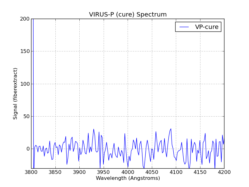 |
Simple plot of a cure-reduced VIRUS-P spectrum from the
vp_spec.py code.
% vp_spec.py Spec.text 3800 4200 -30 200The source code is shown below:
#!/usr/bin/python
#
# plot a spectrum from an ascci file
# The asccii file is  like that from running fiberextract(cure)
# and getspec_from_fits.py)
#
# Sample usage:
# vp_spec.py Spec.text -30 200

# Setup to read the name of the input file
from sys import argv
script_name, infile1, xlo, xhi, ylo, yhi = argv

# Numpy is a library for handling arrays (like data points)
import numpy as npsubs

# Pyplot is a module within the matplotlib library for plotting
import matplotlib.pyplot as plt

# Remove SciPy stuff for now (Feb3,2015)
# Scipy is a library with many useful numerical tasks
#from scipy import stats
#from scipy.stats import norm

#==================================================
# Read the spectrum
# Open the files for read-only
f = open(infile1, 'r')
# initialize some variable to be lists:
fnum = []
x1 = []
y1 = []
n1 = 0
for line in f:
    p = line.split()
    x1.append(float(p[0]))
    y1.append(float(p[1]))
    n1 = n1+1
f.close()
#==================================================

# Create the numpy arrays
xv1 = npsubs.array(x1)
yv1 = npsubs.array(y1)

# set the plotted axis limits -- hard code for now
# use some statistics functions
Xmean = npsubs.mean(xv1)
Xstd  = npsubs.std(xv1)
print 'X(mean,stdev): %.3f %.3f' % (Xmean,Xstd)
Xmin  = npsubs.amin(xv1)
Xmax  = npsubs.amax(xv1)
print '\nRange of input data: \n'
print 'X(min,max): %.3f %.3f' % (Xmin,Xmax)

# Set up the axes
#xlo="3000.0"
#xhi="6000.0"
#ylo="-20"
#yhi="1000"
xlim1 = float(xlo)
xlim2 = float(xhi)
ylim1 = float(ylo)
ylim2 = float(yhi)
plt.xlim(xlim1,xlim2)
plt.ylim(ylim1,ylim2)

# Plot the data
#plt.scatter(xv1, yv1, s=25, facecolor="none", edgecolor="red", label="dX")
plt.plot(xv1, yv1, c='blue', linestyle='-', label='VP-cure')

# linestyle values: '-'  '--'  '-.' ':'  'None'

# add some fancy touches
plt.grid(True)
plt.legend()

# label the axes
plt.title("VIRUS-P (cure) Spectrum")
plt.xlabel("Wavelength (Angstroms) ")
plt.ylabel("Signal (fiberextract)")

#plt.show()
plt.savefig('spectrum.png')
print '\nUse to view your plot:\ndisplay spectrum.png\n'
|
I needed to make some plots of AIP data that used some new and useful techniques. The files for this are in a rather non-standard place:
% pwd
/home/sco/sco/projects/VIRUS/AIP_fiber_Data/code/python

% ls
fiber_plot1.py*  fiber_plot2.py*  README
The test data are in:  $tdata/T_runs/pxy_S_scat.py/ex2_aip/S

To make a plot with specified aspect ratio:
% fiber_plot1.py VIFU6-005_IFUscale.txt VIFU6-005-refhead_IFUscale.txt

To plot computed residuals:
% fiber_plot2.py VIFU6-005_IFUscale.txt VIFU6-005-refhead_IFUscale.txt
Examples of plots made with these two codes are shown below, along with the source code for each.
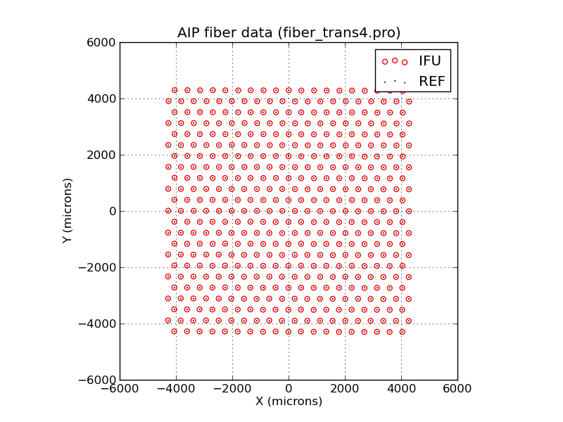 |
Plotting AIP data with a user-specified aspect ratio.
% fiber_plot1.py VIFU6-005_IFUscale.txt VIFU6-005-refhead_IFUscale.txt

The source code:


#!/usr/bin/python
#
# plot a AIP IFU fiber info
#
# Sample usage:
# fiber_plot1.py dat1.in dat2.in

# Setup to read the name of the input file
from sys import argv
script_name, infile1, infile2 = argv

# Numpy is a library for handling arrays (like data points)
import numpy as npsubs

# Pyplot is a module within the matplotlib library for plotting
import matplotlib.pyplot as plt

# Remove SciPy stuff for now (Feb3,2015)
# Scipy is a library with many useful numerical tasks
#from scipy import stats
#from scipy.stats import norm

#==================================================
# Read the test IFU set
# Open the files for read-only
f = open(infile1, 'r')
header1 = f.readline()
header2 = f.readline()
header3 = f.readline()
header4 = f.readline()
header5 = f.readline()
# initialize some variable to be lists:
fnum = []
x1 = []
y1 = []
r1 = []
n1 = 0
for line in f:
#    line = line.strip()
    p = line.split()
    fnum.append(float(p[0]))
    x1.append(float(p[1]))
    y1.append(float(p[2]))
    r1.append(float(p[3]))
    n1 = n1+1
f.close()
#==================================================

#==================================================
# Read the refhead IFU set
# Open the files for read-only
f = open(infile2, 'r')
headr1 = f.readline()
headr2 = f.readline()
headr3 = f.readline()
headr4 = f.readline()
headr5 = f.readline()
# initialize some variable to be lists:
fnum2 = []
x2 = []
y2 = []
r2 = []
n2 = 0
for line in f:
    p = line.split()
    fnum2.append(float(p[0]))
    x2.append(float(p[1]))
    y2.append(float(p[2]))
    r2.append(float(p[3]))
    n2 = n2+1
f.close()
#==================================================

# Create the numpy arrays
xv1 = npsubs.array(x1)
yv1 = npsubs.array(y1)
rv1 = npsubs.array(r1)
xv2 = npsubs.array(x2)
yv2 = npsubs.array(y2)
rv2 = npsubs.array(r2)

# set the plotted axis limits -- hard code for now
# use some statistics functions
Xmean = npsubs.mean(xv1)
Xstd  = npsubs.std(xv1)
print 'X(mean,stdev): %.3f %.3f' % (Xmean,Xstd)
Xmin  = npsubs.amin(xv1)
Xmax  = npsubs.amax(xv1)
print '\nRange of input data: \n'
print 'X(min,max): %.3f %.3f' % (Xmin,Xmax)

# Set up the axes
xlo="-6000"
xhi="+6000"
ylo=xlo
yhi=xhi
xlim1 = float(xlo)
xlim2 = float(xhi)
ylim1 = float(ylo)
ylim2 = float(yhi)
plt.xlim(xlim1,xlim2)
plt.ylim(ylim1,ylim2)
plt.axes(aspect=1)

# Plot the data
plt.scatter(xv1, yv1, s=25, facecolor="none", edgecolor="red", label="IFU")
plt.scatter(xv2, yv2, marker=".", c="blue", s=1, label="REF")

# add some fancy touches
plt.grid(True)
plt.legend()

# label the axes
plt.title("AIP fiber data (fiber_trans4.pro)")
plt.xlabel("X (microns)")
plt.ylabel("Y (microns)")

#plt.show()
plt.savefig('fiber_plot1.png')
print '\nUse to view your plot:\ndisplay fiber_plot1.png\n'
|
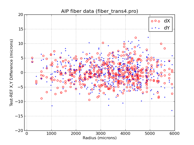 |
Plotting AIP data using X,Y residuals I compute inside the code.
% fiber_plot2.py VIFU6-005_IFUscale.txt VIFU6-005-refhead_IFUscale.txt

The source code:


#!/usr/bin/python
#
# plot a AIP IFU fiber info
#
# Sample usage:
# fiber_plot2.py dat1.in dat2.in

# Setup to read the name of the input file
from sys import argv
script_name, infile1, infile2 = argv

# Numpy is a library for handling arrays (like data points)
import numpy as npsubs

# Pyplot is a module within the matplotlib library for plotting
import matplotlib.pyplot as plt

# Remove SciPy stuff for now (Feb3,2015)
# Scipy is a library with many useful numerical tasks
#from scipy import stats
#from scipy.stats import norm

#==================================================
# Read the test IFU set
# Open the files for read-only
f = open(infile1, 'r')
header1 = f.readline()
header2 = f.readline()
header3 = f.readline()
header4 = f.readline()
header5 = f.readline()
# initialize some variable to be lists:
fnum = []
x1 = []
y1 = []
r1 = []
n1 = 0
for line in f:
#    line = line.strip()
    p = line.split()
    fnum.append(float(p[0]))
    x1.append(float(p[1]))
    y1.append(float(p[2]))
    r1.append(float(p[3]))
    n1 = n1+1
f.close()
#==================================================

#==================================================
# Read the refhead IFU set
# Open the files for read-only
f = open(infile2, 'r')
headr1 = f.readline()
headr2 = f.readline()
headr3 = f.readline()
headr4 = f.readline()
headr5 = f.readline()
# initialize some variable to be lists:
fnum2 = []
x2 = []
y2 = []
r2 = []
n2 = 0
for line in f:
    p = line.split()
    fnum2.append(float(p[0]))
    x2.append(float(p[1]))
    y2.append(float(p[2]))
    r2.append(float(p[3]))
    n2 = n2+1
f.close()
#==================================================

# Create the numpy arrays
xv1 = npsubs.array(x1)
yv1 = npsubs.array(y1)
rv1 = npsubs.array(r1)
xv2 = npsubs.array(x2)
yv2 = npsubs.array(y2)
rv2 = npsubs.array(r2)

# set the plotted axis limits -- hard code for now
# use some statistics functions
Xmean = npsubs.mean(xv1)
Xstd  = npsubs.std(xv1)
print 'X(mean,stdev): %.3f %.3f' % (Xmean,Xstd)
Xmin  = npsubs.amin(xv1)
Xmax  = npsubs.amax(xv1)
print '\nRange of input data: \n'
print 'X(min,max): %.3f %.3f' % (Xmin,Xmax)

# Set up the axes
xlo="-100"
xhi="+6000"
ylo=-20
yhi=20
xlim1 = float(xlo)
xlim2 = float(xhi)
ylim1 = float(ylo)
ylim2 = float(yhi)
plt.xlim(xlim1,xlim2)
plt.ylim(ylim1,ylim2)
#plt.axes(aspect=1)

# Create the difference arrays
delx=xv1
dely=yv1
i=0
while True:
  if i < n1:
   delx[i]=xv1[i]-xv2[i]
   dely[i]=yv1[i]-yv2[i]
   print "%.3f %.3f \n" % (delx[i],dely[i])
  else:
   break
  i=i+1

# Plot the data
plt.scatter(r1, delx, s=25, facecolor="none", edgecolor="red", label="dX")
plt.scatter(r1, dely, s=10, marker="+", c="blue", label="dY")

# add some fancy touches
plt.grid(True)
plt.legend()

# label the axes
plt.title("AIP fiber data (fiber_trans4.pro)")
plt.xlabel("Radius (microns)")
plt.ylabel("Test-REF X,Y Difference (microns)")

#plt.show()
plt.savefig('fiber_plot2.png')
print '\nUse to view your plot:\ndisplay fiber_plot2.png\n'
|
Actually, this example shows two important things I have been trying to understand for some time:
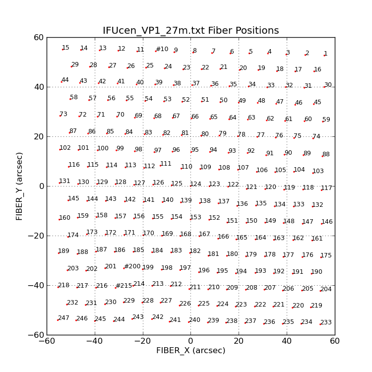 |
I plot the positions (small red circles) of the VIRUS-P fiber
positions read from the file IFUcen_VP1_27m.txt. Then I annotate
each fiber with it's assigned fiber number (in the IFUcen file).
By changing the value of my last argument on the command line
I can change the size of the Text labeling each fiber.
% plot_vp_ifucen.py Y 8

 arg1 = Y/N answer (not used yet)
 arg2 = size of text labels of fiber annotation (integer)

The source code:


#!/usr/bin/python
#
# plot IFU fiber positions from IFUcen_VP1_27m.txt
#
# Sample usage:
# plot_vp_ifucen.py Y 9
# arg1 = Y/N answer (not used yet)
# arg2 = size of text labels of fiber annotation (integer)

# Setup to read the name of the input file
from sys import argv
script_name, Answer1, Tsize = argv

# Numpy is a library for handling arrays (like data points)
import numpy as npsubs

# Pyplot is a module within the matplotlib library for plotting
import matplotlib.pyplot as plt

#==================================================
# Read IFUcen_VP1_27m.txt
# Open the files for read-only
f = open('IFUcen_VP1_27m.txt', 'r')
header1 = f.readline()
header2 = f.readline()
header3 = f.readline()
# initialize some variable to be lists:
fname = []
x1 = []
y1 = []
n1 = 0
for line in f:
    p = line.split()
    fname.append(p[0])
    x1.append(float(p[1]))
    y1.append(float(p[2]))
    n1 = n1+1
f.close()
print "The number of fibers = %s\n" % (n1)
#==================================================

# Create the numpy arrays
xv1 = npsubs.array(x1)
yv1 = npsubs.array(y1)

# set the plotted axis limits -- hard code for now
# use some statistics functions
Xmean = npsubs.mean(xv1)
Xstd  = npsubs.std(xv1)
print 'X(mean,stdev): %.3f %.3f' % (Xmean,Xstd)
Xmin  = npsubs.amin(xv1)
Xmax  = npsubs.amax(xv1)
#print '\nRange of input data: \n'
#print 'X(min,max): %.3f %.3f' % (Xmin,Xmax)

###################################################
# Set the physical size
xpsize = 7.5
ypsize = 7.5
fig = plt.figure(figsize = (xpsize,ypsize))
###################################################

# Set up the axes
xlo="-60"
xhi="+60"
ylo=xlo
yhi=xhi
xlim1 = float(xlo)
xlim2 = float(xhi)
ylim1 = float(ylo)
ylim2 = float(yhi)
plt.xlim(xlim1,xlim2)
plt.ylim(ylim1,ylim2)
#plt.axes(aspect=1) # using this ignores my plt.xlim,plt.ylim!

# Plot the data
plt.scatter(xv1, yv1, s=2, facecolor="none", edgecolor="red", label="IFU")
#plt.scatter(xv2, yv2, marker=".", c="blue", s=1, label="REF")

############################################################
#Tsize = 10
ii = 0
while True:
 if ii < n1:
  texto = fname[ii]
  plt.annotate(texto, xy=(0,0), xytext=(xv1[ii],yv1[ii]), color='black', size=Tsize)
 else:
  break
 ii=ii+1
############################################################

# add some fancy touches
plt.grid(True)
# plt.legend()

# label the axes
plt.title("IFUcen_VP1_27m.txt Fiber Positions")
plt.xlabel("FIBER_X (arcsec)")
plt.ylabel("FIBER_Y (arcsec)")

#plt.show()
plt.savefig('ifu_VP.png')
print '\nUse to view your plot:\ndisplay ifu_VP.png\n'
|
Sometimes I want to plot a symbol with a different shade fo grey.
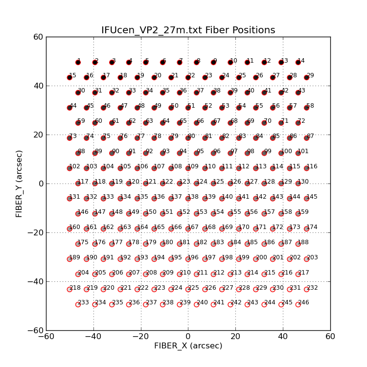 |
Grey-scale levels can be desigated with a floating point value
between 0 and 1. I generate these on plot_vp2_ifucen.py by dividing
the current index (ii) by 250.
% plot_vp2_ifucen.py Y 9

The source code:


#!/usr/bin/python
#
# plot IFU fiber positions from IFUcen_VP2_27m.txt
#
# Sample usage:
# plot_vp2_ifucen.py Y 9
# arg1 = Y/N answer (not used yet)
# arg2 = size of text labels of fiber annotation (integer)

# Setup to read the name of the input file
from sys import argv
script_name, Answer1, Tsize = argv

# Numpy is a library for handling arrays (like data points)
import numpy as npsubs

# Pyplot is a module within the matplotlib library for plotting
import matplotlib.pyplot as plt

#==================================================
# Read IFUcen_VP2_27m.txt
# Open the files for read-only
f = open('IFUcen_VP2_27m.txt', 'r')
header1 = f.readline()
header2 = f.readline()
header3 = f.readline()
# initialize some variable to be lists:
fname = []
x1 = []
y1 = []
n1 = 0
for line in f:
    p = line.split()
    fname.append(p[0])
    x1.append(float(p[1]))
    y1.append(float(p[2]))
    n1 = n1+1
f.close()
print "The number of fibers = %s\n" % (n1)
#==================================================

# Create the numpy arrays
xv1 = npsubs.array(x1)
yv1 = npsubs.array(y1)

#---------------------------
# assign greyscale value
gs = npsubs.array(x1)
ii = 0
while True:
 if ii < n1:
  gs[ii] = float(ii)/250.0
  print gs[ii]
 else:
  break
 ii=ii+1
#---------------------------

# set the plotted axis limits -- hard code for now
# use some statistics functions
Xmean = npsubs.mean(xv1)
Xstd  = npsubs.std(xv1)
print 'X(mean,stdev): %.3f %.3f' % (Xmean,Xstd)
Xmin  = npsubs.amin(xv1)
Xmax  = npsubs.amax(xv1)
#print '\nRange of input data: \n'
#print 'X(min,max): %.3f %.3f' % (Xmin,Xmax)

###################################################
# Set the physical size
xpsize = 7.5
ypsize = 7.5
fig = plt.figure(figsize = (xpsize,ypsize))
###################################################

# Set up the axes
xlo="-60"
xhi="+60"
ylo=xlo
yhi=xhi
xlim1 = float(xlo)
xlim2 = float(xhi)
ylim1 = float(ylo)
ylim2 = float(yhi)
plt.xlim(xlim1,xlim2)
plt.ylim(ylim1,ylim2)
#plt.axes(aspect=1) # using this ignores my plt.xlim,plt.ylim!

# Plot the data
#plt.scatter(xv1, yv1, s=2, facecolor="none", edgecolor="red", label="IFU")
#plt.scatter(xv1, yv1, s=50, facecolor=gs, edgecolor='red', label='IFU')

#--TEST
# assign greyscale value
ii = 0
while True:
 if ii < n1:
  xx = xv1[ii]
  yy = yv1[ii]
  gso = "%.3f" % (gs[ii])
  print gso
  plt.scatter(xx, yy, s=50, facecolor=gso, edgecolor='red')
 else:
  break
 ii=ii+1
#---------------------------

############################################################
#Tsize = 10
ii = 0
while True:
 if ii < n1:
  texto = fname[ii]
  plt.annotate(texto, xy=(0,0), xytext=(xv1[ii],yv1[ii]), color='black', size=Tsize)
 else:
  break
 ii=ii+1
############################################################

# add some fancy touches
plt.grid(True)
# plt.legend()

# label the axes
plt.title("IFUcen_VP2_27m.txt Fiber Positions")
plt.xlabel("FIBER_X (arcsec)")
plt.ylabel("FIBER_Y (arcsec)")

#plt.show()
plt.savefig('ifu_VP2.png')
print '\nUse to view your plot:\ndisplay ifu_VP2.png\n'
|
There is an easy way to make multiple plots.
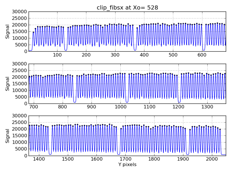 |
Multiple plots of VIRUS-P fiber locations in a skyflat.
% vp_fibs2_all.py X_528_fibx.out 0 30000 PEAKS.528

The source code:


#!/usr/bin/python
#
# Sample usage:
# vp_fibs2_all.py dat.in  0.0 20000.0 file_of_peaks

# Setup to read the name of the input file
from sys import argv
script_name, infile, ylo, yhi, fpeaks_file = argv

# Numpy is a library for handling arrays (like data points)
import numpy as npsubs

# Pyplot is a module within the matplotlib library for plotting
import matplotlib.pyplot as plt

########################################################################
# Read the sequence of signals from a code like clip_fibsx
# Open the files for read-only
f = open(infile, 'r')
header1 = f.readline()
label_main  = header1.rstrip()
label_xaxis = "Y pixels"
label_yaxis = "Signal"
# initialize some variable to be lists:
x1 = []
y1 = []
# read each data line and load the data lists x1,y1,x1err,y1err
npoints = 0
for line in f:
    p = line.split()
    x1.append(float(p[0]))
    y1.append(float(p[1]))
    npoints = npoints+1
f.close()
# Create the numpy arrays
xv = npsubs.array(x1)
yv = npsubs.array(y1)
########################################################################

########################################################################
# Read the peak values
# Open the files for read-only
f = open(fpeaks_file, 'r')
# initialize some variable to be lists:
pn = []
x2 = []
y2 = []
# read each data line and load the data lists x1,y1,x1err,y1err
npeaks = 0
for line in f:
    p = line.split()
    pn.append(p[0])
    x2.append(float(p[1]))
    y2.append(float(p[2]))
    npeaks = npeaks+1
f.close()
# Create the numpy arrays
xv2 = npsubs.array(x2)
yv2 = npsubs.array(y2)
########################################################################

#=====================================================
# Make Top plot in   subplot(Nrow,Ncols,Current_num)
plt.subplot(3,1,1)
# Plot the data
plt.plot(xv, yv, c='blue', linestyle='-', label='VP-cure')
# Plot the peaks
plt.scatter(xv2, yv2, c='red', marker='*', s=10, label='Peaks')
# add some fancy touches
plt.grid(True)
#plt.legend()
xlo=1.0
xhi=682.0
xlim1 = float(xlo)
xlim2 = float(xhi)
ylim1 = float(ylo)
ylim2 = float(yhi)
plt.xlim(xlim1,xlim2)
plt.ylim(ylim1,ylim2)
# label the axes
plt.title(label_main)
#plt.xlabel(label_xaxis)
plt.ylabel(label_yaxis)
#=====================================================

#=====================================================
# Make Middle plot in   subplot(Nrow,Ncols,Current_num)
plt.subplot(3,1,2)
# Plot the data
plt.plot(xv, yv, c='blue', linestyle='-', label='VP-cure')
# Plot the peaks
plt.scatter(xv2, yv2, c='red', marker='*', s=10, label='Peaks')
# add some fancy touches
plt.grid(True)
#plt.legend()
xlo=682.0
xhi=1364.0
xlim1 = float(xlo)
xlim2 = float(xhi)
ylim1 = float(ylo)
ylim2 = float(yhi)
plt.xlim(xlim1,xlim2)
plt.ylim(ylim1,ylim2)
# label the axes
#plt.title(label_main)
#plt.xlabel(label_xaxis)
plt.ylabel(label_yaxis)
#=====================================================

#=====================================================
# Make Bottom plot in   subplot(Nrow,Ncols,Current_num)
plt.subplot(3,1,3)
# Plot the data
plt.plot(xv, yv, c='blue', linestyle='-', label='VP-cure')
# Plot the peaks
plt.scatter(xv2, yv2, c='red', marker='*', s=10, label='Peaks')
# add some fancy touches
plt.grid(True)
#plt.legend()
xlo=1364.0
xhi=2048.0
xlim1 = float(xlo)
xlim2 = float(xhi)
ylim1 = float(ylo)
ylim2 = float(yhi)
plt.xlim(xlim1,xlim2)
plt.ylim(ylim1,ylim2)
# label the axes
#plt.title(label_main)
plt.xlabel(label_xaxis)
plt.ylabel(label_yaxis)
#=====================================================

plt.tight_layout()

#plt.show()
plt.savefig('vp_fibs2_all.png')
print '\nUse to view your plot:\ndisplay vp_fibs2_all.png\n'
|
I can easily generate nice grayscale galaxy images (in png format) with ds9. To make a good plot with markers use this.
To run the code:
% gs.py n3379_B.png
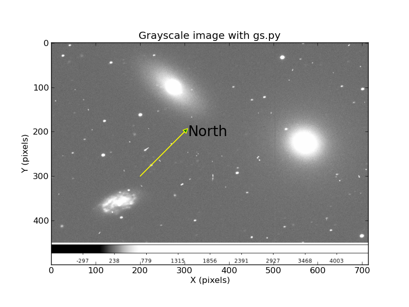 |
An image of NGC3379 with a vector for North (random direction, just a demo!).
The full source code for this is shown below:
#!/usr/bin/python

from sys import argv
script_name, pngname = argv

import numpy as np
import matplotlib.pyplot as plt
import matplotlib.cm as cm
import Image

import pylab as P

print "Input file: %s" % (pngname)
image = Image.open(pngname).convert("L")
arr = np.asarray(image)
plt.imshow(arr, cmap = cm.Greys_r)

############################################################
# Draw an arrow
# P.arrow( x, y, dx, dy, **kwargs )
x=200.0
y=300.0
dx = 100.0
dy = -100.0
# fc = facecolor
# ec = edgecolor
P.arrow( x, y, dx, dy, facecolor="green", ec="yellow",
head_width=10.0, head_length=10.0 )
############################################################

############################################################
# Make a text label
xl=x+dx+10.0
yl=y+dy+10.0
texto = "North"
Tsize = 20.0
plt.annotate(texto, xy=(0,0), xytext=(xl,yl), color='black',
  size=Tsize)
############################################################

label_main = "Grayscale image with gs.py"
label_xaxis = "X (pixels)"
label_yaxis = "Y (pixels)"

# label the axes
plt.title(label_main)
plt.xlabel(label_xaxis)
plt.ylabel(label_yaxis)

#plt.show()
plt.savefig('gs.png')
print '\nUse to view your plot:\ndisplay gs.png\n'
|
Finally I have found a fairly easy piece of code that demos how to use an interactive cursor in the matplotlib show() module. Here is the code with a little bit of diddling by me at the end. Thi routine generates a sequence of numbers and then the sin value of these numbers. It can record up to 5 (x,y) positions of clicks.
The code lives in:
 /home/sco/sco/codes/python/cursor/apr6/c1.py

To run the code:
% python c1.py

% cat c1.py
#!/usr/bin/env python
import numpy as np
import matplotlib.pyplot as plt

x = np.arange(-10,10)
y = x**2

fig = plt.figure()
ax = fig.add_subplot(111)
ax.plot(x,y)

coords = []

def onclick(event):
    global ix, iy
    ix, iy = event.xdata, event.ydata
    print 'x = %d, y = %d'%(
        ix, iy)

    global coords
    coords.append((ix, iy))

    if len(coords) == 4:
        fig.canvas.mpl_disconnect(cid)

    return coords
cid = fig.canvas.mpl_connect('button_press_event', onclick)
plt.show()

# Coords is a list of lists
print "I will print coords here: "
type(coords)
nc=len(coords)
print "Number of x,y sests in coords = %d" % (nc)

for i in range(0,nc):
  print i
  s = coords[i]
  print "%9.3f %9.3f"  % (s[0],s[1])

#print coords[0]
#s=coords[0]
#print "x,y = %d %d" % (s[0],s[1])

# To run the code:
% c1.py
x = -6, y = 38
x = -4, y = 32
x = -1, y = 22
x = 0, y = 15
x = 1, y = 25
I will print coords here:
Number of x,y sests in coords = 5
0
   -6.993    38.520
1
   -4.730    32.653
2
   -1.434    22.704
3
    0.749    15.561
4
    1.663    25.510
This is crude, but I can cobble this into something that works.