Use a simple ASCII input file to plot a list multiple X,Y data sets with the python matplotlib package.
I wrote a script named mpl that provides a brief summary of point type a color properties.
The initial list and some manual fixes.
You should view the doc for pxy_Serr_scat to see more detail about the simple (hence the "S") codes and some other more complicated methods. There are test data sections ($tdata) for many of these codes.
% pxy_SM_scat.py -h
usage: pxy_SM_scat.py [-h] [-v] arg1 arg2 arg3 arg4 arg5

positional arguments:
  arg1           input data file
  arg2           low value for X axis
  arg3           high value for X axis
  arg4           low value for Y axis
  arg5           high value for Y axis

optional arguments:
  -h, --help     show this help message and exit
  -v, --verbose  Verbose responses


For an example:
See : $tdata/T_runs/pxy_SM_scat.py/ex0

% cat dat.1
r * 100
Predicted
350 -350
150 150
350 350
-150 -150
-150 -150
-350 -350
-150 150
-350 350
150 -150
0 0
-550 50
550 -50
50 -350
-50 350

% cat dat.2
green p 50
Observed
-341.7 +357.0
-153.4 -147.0
-357.5 -342.3
+152.8 +146.3
+357.0 +341.6
+146.3  -153.8
+341.5 -357.6
-146.8  +153.0
+552 -36
-548  +33
-71 +348
+70 -346

% cat list.1
IHMP Offsets
X_offset(arcsec)
Y_offset(arcsec)
dat.1
dat.2

To make the plot:
% pxy_SM_scat.py list.1 -700 700 -700 700
The first line arguments in each *.dat file is "color point_type size". The second line is a set name. The X,Y data values follow.
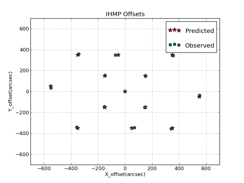 |
A simple plot made with pxy_SM_scat.py. The files
and run list for this example are in:
$tdata/T_runs/pxy_SM_scat.py/ex0. |
Marker types.
We can choose from a variety of marker types.
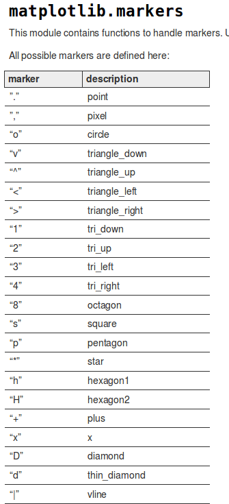 |
| Marker type values and the resultant point symbols. |
Plotting with lines.
It is often useful plot a set of X,Y data using a line. I added this ability in March 2016. If you assign the marker type to be "line", then the data are plotted as a line. Here is an example I wrote for plotting stellar spectra:
% head A1.spec
blue line 10
A1
  3510.0     87.272
  3515.0     86.902
  3520.0     86.972
  3525.0     86.871
  3530.0     87.488

% head G1.spec
green . 10
G1
  3510.0     63.688
  3515.0     63.019
  3520.0     62.145
  3525.0     61.359

% cat RUN1
#
pxy_SM_scat.py plot.style 3400 5000 25 250
display pxy.png
The addition of a line option, made in March 2016, makes this code much more general!
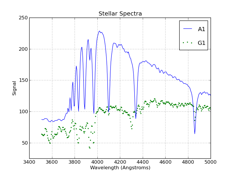 |
A simple plot made with pxy_SM_scat.py where I have used both
markers and lines. The files and run list for this example are in
$tdata/T_runs/pxy_SM_scat.py/ex1_with_lines |
Back to SCO CODES page