Use a simple ASCII input file to plot a single X,Y data set with the python matplotlib package. I have also prepared some simple examples of how to build some plot codes that do more complicated things (like using multiple symbols, etc...). In this version of the S-series (S=simple) the input file is expected to have 4 columns of data: X, Xerr, Y, Yerr. The error bars for each axis are plotted for every point.
I wrote a script named mpl that provides a brief summary of point type a color properties.
Notice below that the error bars, if small, can greatly interfere with the color of the points. Hence, I later wrote a simpler version of this code named pxy_S_scat.py that reads and plots only X,Y values.
A set of example file and some README helps are in the $TDATA directories (got, T_runs/pxy_S_scat.py/ex0). You can use the "-h" flag to learn about the arguments for this code:
% pxy_Serr_scat.py -h
usage: pxy_Serr_scat.py [-h] [-v] arg1 arg2 arg3 arg4 arg5

positional arguments:
  arg1           input data file
  arg2           low value for X axis
  arg3           high value for X axis
  arg4           low value for Y axis
  arg5           high value for Y axis

optional arguments:
  -h, --help     show this help message and exit
  -v, --verbose  Verbose responses
To run a data set, you must construct an input file that has information about the axis labeleing, point style, etc... like the following:
% cat dat.1
Some Data I Have                   # Main title
Parameter A                        # X label
The Y Parameters (in a string)     # Y label
r * 100                            # Symbol (color,type,size)
Set 12 Name                        # Info string for a data label
1.0 0.4  1.1  1.22                 # x, err_x, y, err_y
2.0 0.1  1.9  0.10
3.0 0.2  3.1  0.55
4.0 0.3  4.4  0.28
5.0 0.1  4.6  0.26
% pxy_S_scat.py dat.1 0.0 7.0 -1.0 9.0
The plot is not very fancy, but this code should be extremely easy to maintain and always available for making quick plots. The 4 numerical input values on the command line (after the name of the data file) are the Xmin,Xmax and Ymin,Ymax to be used for the plot boundaries. As these are often the things you want to play around with in composing a plot, they are fed as command line arguments for the sake of speed.
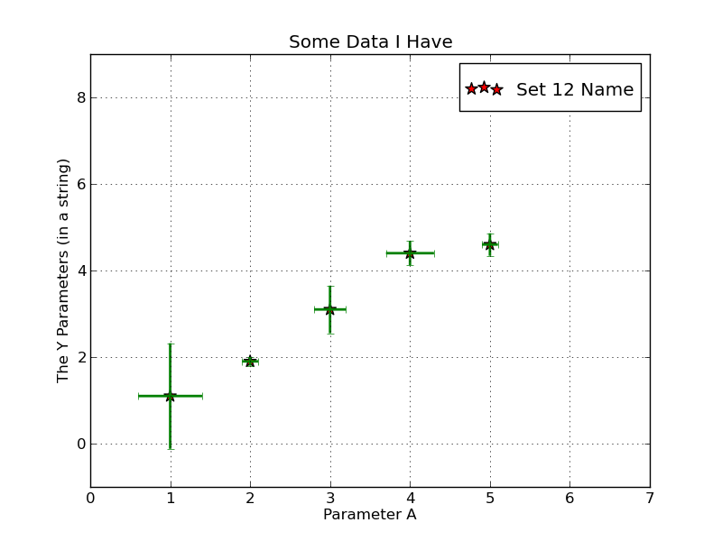 |
| A sample plot from pxy_S_scat. |
A more typical plot in the $TDATA example set is made using the input file named "dat.spirals". To generate the plot:
% pxy_Serr_scat.py dat.spirals 0.8 1.8 10.0 17.0
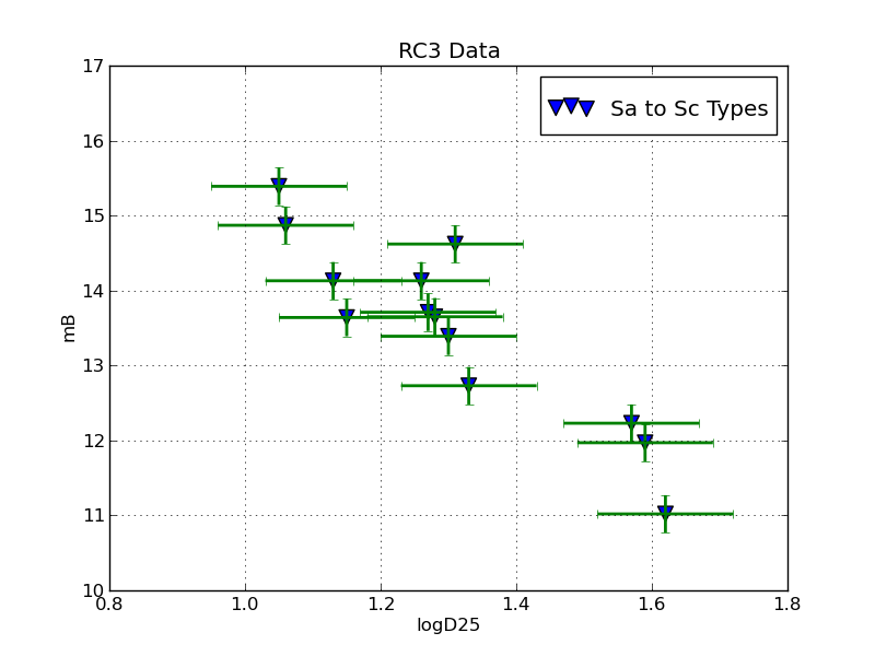 |
| A sample plot from pxy_S_scat using RC3 spiral galaxy data. |
Symbol Attributes
I wondered about how to change the symbol types. I googled "symbol attributes in matplotlib scatter plot" and found lots of things, the second of which was very useful!. For the sake of completeness in my offline notes, I show a small part of a graphic from that webdoc below:
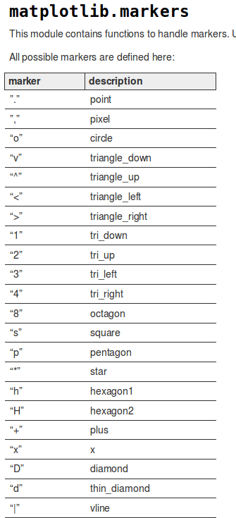 |
| Examples of marke types. |
For color specification:
Commands which take color arguments can use several formats
to specify the colors. For the basic built-in colors, you
can use a single letter:

        b: blue
        g: green
        r: red
        c: cyan
        m: magenta
        y: yellow
        k: black
        w: white

Gray shades can be given as a string encoding a float in
the 0-1 range, e.g.:

  color = '0.75'

For a greater range of colors, you have two options. You can
specify the color using an html hex string, as in:

color = '#eeefff'
Back to SCO CODES page