 |
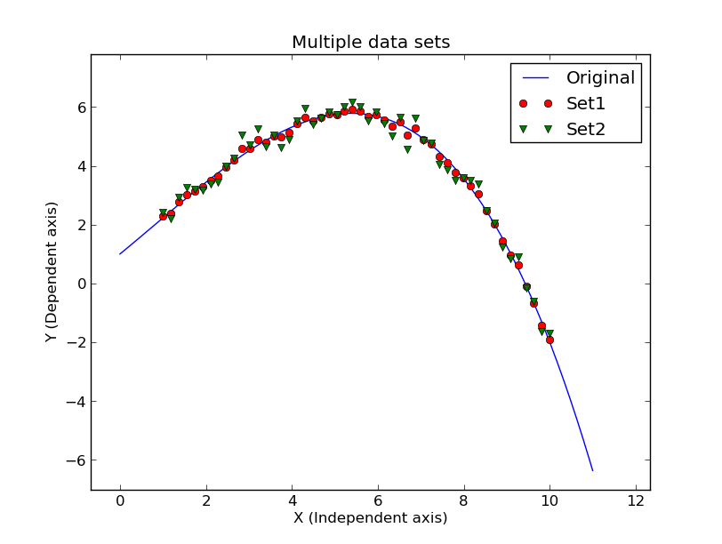
| Example of a plot made with the R3 script described above. |
I have a very easy way to generate test data sets. The sets will be be generated using some analytic function (polynomial, gaussia, exponential, etc...) and some level of user-specified noise can be added to the Y-axis. This should all be done with a call to one script. Next, I want a simple way to plot this, and other suxh files, using a few simple calls from within ipython (or just running python insteractively).
Here is a crude (but complete) script that I use to run the production of noisy polynomial data. For generating a plot, I just echo the commands I need to run in ipython (or python).
#!/bin/bash

# Check command line arguments
if [ -z "$1" ]
then
    printf "Usage: R1 1.0  \n"
    printf "arg1 - noise on y axis \n"
    exit
fi
sig="$1"

# Make the coefficients file
echo "1.0 " > c.1
echo "1.2" >> c.1
echo "0.05" >> c.1
echo "-0.02" >> c.1

# generate the curve
gen_curve.sh poly4 c.1 50 1.0 10.0 > MyData.1

# strip to single column x,y files
echo "# data" > a
colget.py MyData.1 1 X
cat a list.X > list.x
colget.py MyData.1 2 Y
cat a list.Y > list.y

# generate noise
gen_noise.sh gaus 50 0.0 $sig  > list.N

# Add noise to the Y values
oned_imarith.sh list.y + list.N list.YN
paste list.X list.YN > b
cat a b > MyData.2

# python code
echo "from scomods.ascii_tools import *"
echo "x=read1col('1','MyData.1')"
echo "y=read1col('2','MyData.1')"
echo "import matplotlib.pyplot as plt"
echo "plt.plot(x,y,'b-',label='Curve')"
echo "x2=read1col('1','MyData.2')"
echo "y2=read1col('2','MyData.2')"
echo "plt.plot(x2,y2,'ro',label='Noise Added')"
echo "plt.ylabel('Y(noise added)')"
echo "plt.xlabel('X')"
echo "plt.title('4-Term Polynomial Test Data')"
echo "plt.legend(loc=1)"
echo "plt.show()"
This script is klugy and demonstrates some poor mis-matches
between some of my file reading/writing scripts. I suppose the
first place to start cleaning up the process is with the
colget.py script: it presently dumps the numerical columns and does
not attach a "# data" header lines. Most of my codes need that
"# data" line, and so I needed a bunch of junky lines in the
above example to make the files I need. I should feed an argument that
allows a "# data" to be output first if the user desires. Also, I don't
know why I input only part of the output name to colget.py. I should
just pass the full output name and be done.
I have altered a few on my data generation codes (gen_curve.sh, gen_noise.sh, and oned_imarith.sh) and created a new wrapper script called "make_fit_data" that allows me to more simply generate data files. Here is the new and improved version of the R1 script above:
#!/bin/bash

# Check command line arguments
if [ -z "$1" ]
then
    printf "Usage: R2 1.0  \n"
    printf "arg1 - noise on y axis \n"
    exit
fi
sig="$1"

# Make the coefficients file
echo "1.0 " > c.1
echo "1.2" >> c.1
echo "0.05" >> c.1
echo "-0.02" >> c.1

# generate the noiseless data
make_fit_data poly4 c.1 150 1.0 10.0 0.0
mv make_fit_data.out MyData.1

# generate the data with noise
make_fit_data poly4 c.1 50 1.0 10.0 $sig
mv make_fit_data.out MyData.2

# python code
echo "from scomods.ascii_tools import *"
echo "x=read1col('1','MyData.1')"
echo "y=read1col('2','MyData.1')"
echo "import matplotlib.pyplot as plt"
echo "plt.plot(x,y,'b-',label='Curve')"
echo "x2=read1col('1','MyData.2')"
echo "y2=read1col('2','MyData.2')"
echo "plt.plot(x2,y2,'ro',label='Noise Added')"
echo "plt.ylabel('Y(noise added)')"
echo "plt.xlabel('X')"
echo "plt.title('4-Term Polynomial Test Data')"
echo "plt.legend(loc=1)"
echo "plt.show()"
Now our data generation production has essentially ben reduced
to 4 lines of code. We need some packages in python that now will
read and plot these data in these files. The idea will be to add
some functions to scomods that will let me build the plot in just
a few quick calls.
Here I have composed a few simple plot functions. For now (Jul2016) they reside in scomods.ascii_tools, but I may expand upon them and place then in some other package. The two new routines are:
xypf() : plots X,Y data in a file. You send it the name of the file, the
         plot color and type (i.e. "ro" = red circle), and the name for a
         label in the legend box. This unction returns the number of points
         that were plotted.

label_plot(): A call with one argument (that determines where the
            legen will go in the plot)
The new python functions are simple, and not worth showing here. The
new run script (R3) is getting shorter and shorter. We now generate
and plot 3 X,Y sets. Again I print the plot commands, but the number
of such commands is significantly reduced.
% cat R3
#!/bin/bash

# Check command line arguments
if [ -z "$1" ]
then
    printf "Usage: R3 1.0 0.2  \n"
    printf "arg1 - noise on y axis \n"
    exit
fi
sig1="$1"
sig2="$2"

# Make the coefficients file
echo "1.0 " > c.1
echo "1.2" >> c.1
echo "0.05" >> c.1
echo "-0.02" >> c.1

# generate the noiseless data
make_fit_data poly4 c.1 150 0.0 11.0 0.0
mv make_fit_data.out MyData.1

# generate the data with noise
make_fit_data poly4 c.1 50 1.0 10.0 $sig1
mv make_fit_data.out MyData.2

# generate the data with noise
make_fit_data poly4 c.1 50 1.0 10.0 $sig2
mv make_fit_data.out MyData.3

# python code
echo "from scomods.ascii_tools import *"
echo "n1=xyfp('MyData.1','b-','Original')"
echo "n1=xyfp('MyData.2','ro','Set1')"
echo "n1=xyfp('MyData.3','gv','Set2')"
echo "label_plot(1)"
echo "plt.show()"

To make the run:
%  R3 0.1 0.3
from scomods.ascii_tools import *
n1=xyfp('MyData.1','b-','Original')
n1=xyfp('MyData.2','ro','Set1')
n1=xyfp('MyData.3','gv','Set2')
label_plot(1)
plt.show()

%  python
Python 2.7.4 (default, Sep 26 2013, 03:20:26)
[GCC 4.7.3] on linux2
Type "help", "copyright", "credits" or "license" for more information.
>>> from scomods.ascii_tools import *
>>> n1=xyfp('MyData.1','b-','Original')
>>> n1=xyfp('MyData.2','ro','Set1')
>>> n1=xyfp('MyData.3','gv','Set2')
>>> label_plot(1)
Enter X-axis label:
X name
Enter Y-axis label:
Y axis title
Enter plot title:
My Data Sets
>>> plt.show()
>>> quit()
An example of the plot I made with this procedure, in
just a few soconds, is shown below.
|
| Example of a plot made with the R3 script described above. |
Finally, I have assembled a host of scripts that run the routines described in this document. Basicall I create a noiseless data set over the range (0.0 < X < 11.0). Next I use the same procedures over the range (1.0 < X < 10.0) and add noise levels of sigma=0.1 and sigma=0.5. I then print out the commands needed to interactively plot the data with python or ipython. The commands should result in a plot with the noiseless data as a blue line, the sigma=0.1 set plotted as red circles, and the sigma=0.5 set plotted as green "down-pointing triangles". In some cases I move the location of the legend box. In cases of some of the higher order polynomials, I have changed the level of noise added the last two data sets so that the scatter is visible in the plot.
Location of the scripts:
scohtm/basics/scoPython/ipython+numpy/exercise_table/ex07_scripts

pol2.sh   == a 2 term polynomial (a line!)
pol4.sh   == a 4 term polynomial
pol7.sh   == a 7 term polynomial, higher noise
pol10.sh  == a 10 term polynomial, good example of setting plot size
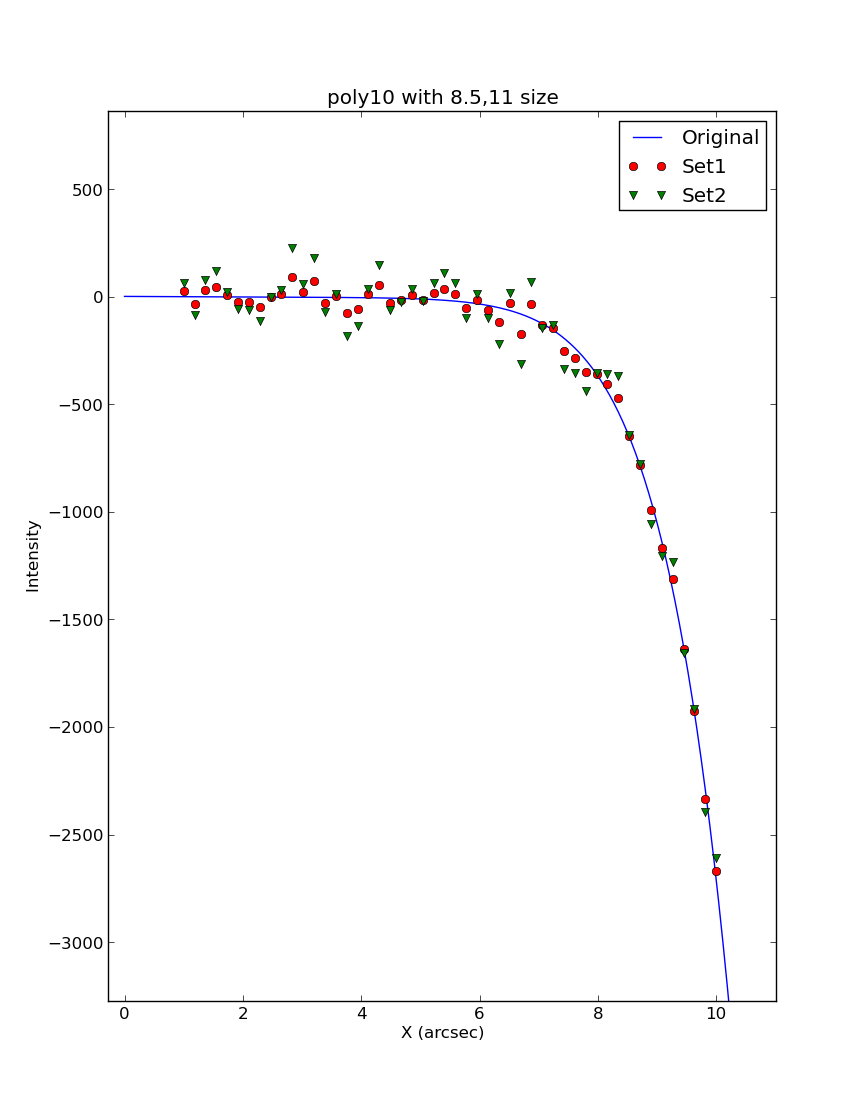 |
Here I have plotted my poly10 script files
using a command to specify the size of the plot in
inched. Here is the seqiuenc of commands used with
python (running interctively):
% python
Python 2.7.4 (default, Sep 26 2013, 03:20:26)
[GCC 4.7.3] on linux2
Type "help", "copyright", "credits" or "license" for more information.
>>> from scomods.ascii_tools import *
>>> plt.figure(figsize=(8.5,11.0))
>>> n1=xyfp('MyData.1','b-','Original')
>>> n1=xyfp('MyData.2','ro','Set1')
>>> n1=xyfp('MyData.3','gv','Set2')
>>> label_plot(1)
Enter X-axis label:
X (arcsec)
Enter Y-axis label:
Intensity
Enter plot title:
poly10 with 8.5,11 size
>>> plt.show()
|
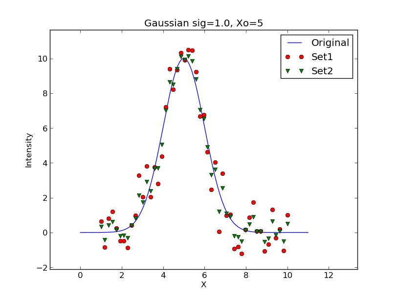 |
Here I have plotted my gauss3p script:
#!/bin/bash

sig1="1.0"
sig2="0.5"

# Check command line arguments
#if [ -z "$1" ]
#then
#    printf "Usage: R3 1.0 0.2  \n"
#    printf "arg1 - noise on y axis \n"
#    exit
#fi

# Make the coefficients file
echo "10.0 " > c.1
echo "5.0" >> c.1
echo "-1.0" >> c.1

# generate the noiseless data
make_fit_data gauss3p c.1 150 0.0 11.0 0.0
mv make_fit_data.out MyData.1

# generate the data with noise
make_fit_data gauss3p c.1 50 1.0 10.0 $sig1
mv make_fit_data.out MyData.2

# generate the data with noise
make_fit_data gauss3p c.1 50 1.0 10.0 $sig2
mv make_fit_data.out MyData.3

# python code
echo "For click-and_drag in python or ipython:"
echo "from scomods.ascii_tools import *"
echo "n1=xyfp('MyData.1','b-','Original')"
echo "n1=xyfp('MyData.2','ro','Set1')"
echo "n1=xyfp('MyData.3','gv','Set2')"
echo "label_plot(1)"
echo "plt.show()"
|