Plotting multiple data sets.
Here I use clip_margdist.sh to build r table files. I use xyplotter_auto to
plot the first set, then I use a litlle editting to add the other data data
sets to a combined plot plot.
% clip_margdist.sh ./20180206T115859.7_acm_sci_BIAS_20180206.fits col
the files I build in this way are:
20180114.parlab  20180114.table  20180115.table  20180116.table  20180206.table

Build the first plot
% xyplotter_auto 20180114 col mean 1

% cat List.1
20180114.table 1 2 0 0   line   b - 70   20180114
20180115.table 1 2 0 0   line   r - 70   20180115
20180116.table 1 2 0 0   line   g - 70   20180116
20180206.table 1 2 0 0   line   c - 70   20180206
~
Build the new plot
% xyplotter List.1 Axes.1
Note that in the example above, I used the python show() module to create
a hardcopy of the plot. This is the file named "figure_1.png". In the
next example, we'll see how to modify the appearance of this plot and
how to easily add other data sets.
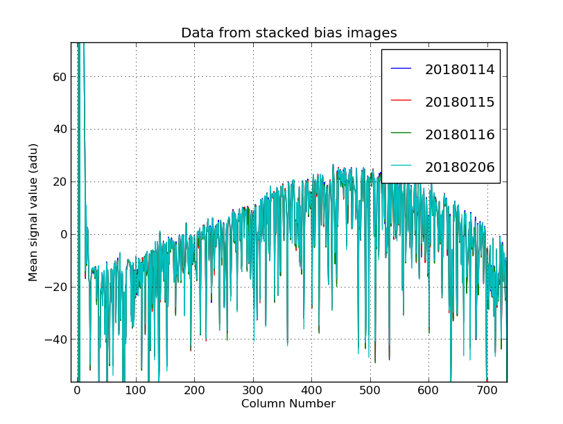 |
I have combine 4 sets of bias data (covering 4 nights) with:
% xyplotter_auto 20180114 col mean 1
% xyplotter List.1 Axes.1
% cat List.1
20180114.table 1 2 0 0   line   b - 70   20180114
20180115.table 1 2 0 0   line   r - 70   20180115
20180116.table 1 2 0 0   line   g - 70   20180116
20180206.table 1 2 0 0   line   c - 70   20180206
/
The four curves represent column averages of stacked bias frames.
|
 |
|
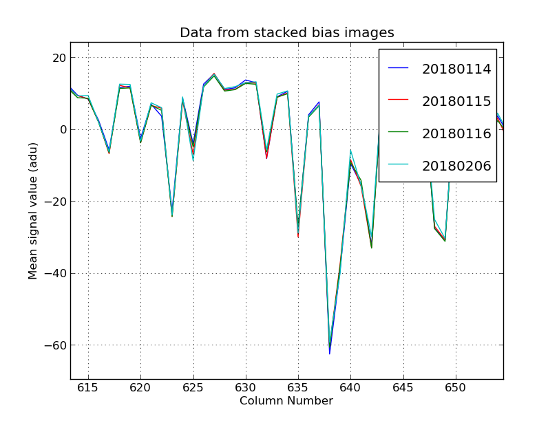
This is a gretly zoomed-in view of a portion of the figure
above. The mean fixed bias patterns from different nights
appear to match quite well. It is diffcult to tell that there
are 4 different curve in this magnified view.
|
Back